Joy Gerrard
Joy Gerrard is an Irish artist and lives and works in Belfast. What was really good to find was that she collaborated or shared the same exhibition Protest and Remembrance alongside Barbara Walker. I was really captivated by Barbara Walkers work in conte crayon and charcoal.
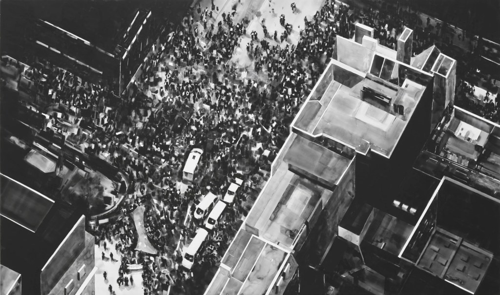
Whilst Barbara Walker provides the larger-than-life images of real soldiers or war personnel, in contrast Gerrard isn’t close up and personal with the figures but captures the masses from a distance in exquisitely drawn aerial views. To create her work she uses images from around the world sourced from the media of crowd scenes. She then transforms the images always looking at the crowd from above.
I researched Gerrards work initially on the QSS Studios and Gallery website
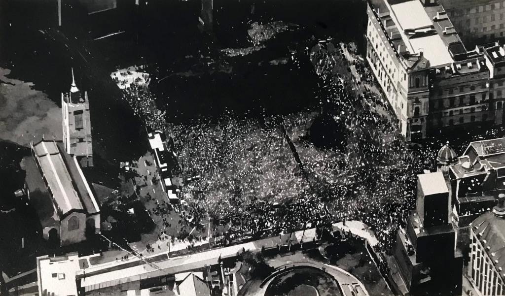
The first two images below depict London Protests around Brexit. The artist works in Japanese ink on both large and smaller work. The work is usually on paper or linen.
The first two images below are from the link to the Cristea Roberts Gallery https://cristearoberts.com/exhibitions/202/
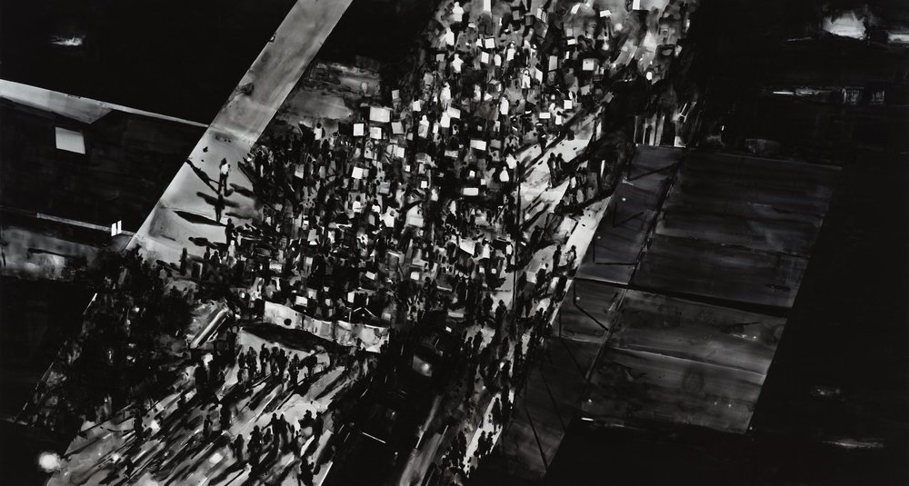
The image below is from a Black Lives Matter Protest in America. I love the clearly visible figure in a white vest with one or two other figures close by marked out also by their shadows. I managed to obtain this image from the artists website. http://www.joygerrard.com/#/and-the-ground-shook/
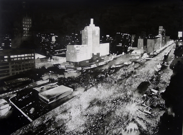
This was an image from a collection of works titled Shot Crowd. The images are part of an installation/collection of works in the RHA Gallery in Dublin.
This next image I took from the Peeruk.org website which was again another link from the artists website. Sadly, it doesn’t state the exact place, but I believe it may be in the Middle East and one of the Arab Spring images. The reason I’ve included this one is I would imagine the paper is black in tone and she has built up lightening the various areas, providing great depth to the composition. Some of the crowd areas are almost totally white and you imagine that there are bright lights in the street.
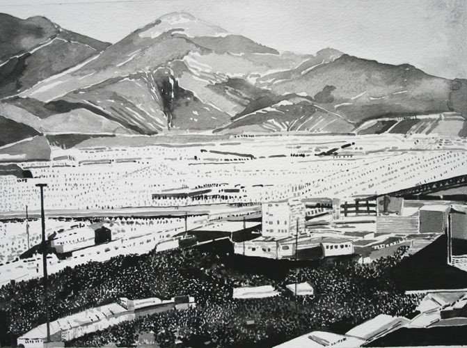
The image above has more of a watercolour painting feel to it particularly in the mountains. Again, the contrast of the dark crowded area really brings us into focus.
I’ve really loved looking at Gerrards work, and I believe there are several factors that all work together to make her work and the images very powerful. First and foremost is that they are all monochromatic. The contrast between dark and light is always intriguing and draws our eyes in to seek and find. Her use of contrasting large scale buildings against the small, tiny impersonal figures also provides a sense of power and the vulnerability of the crowd. No matter how many in number the scale of the buildings makes the people almost invisible. Another factor for me is how we look closer at her work, and she uses the contrasting blacks and whites even in the crowd to help us define the figures. Another factor, very noteworthy is about her technical skills in drawing. The buildings are superbly accurate, and she uses great tones in the buildings that almost create photographic like images. Finally, I think there is always such strong narratives in the work. Sadly, some of the protest and crowd scenes can also be founded on death, destruction or political agenda, so there are always some dramatic undertones that really make us think hard about the world around us.
Research task Artists against injustice
The two artists we are asked to research are OCA’s Simon Manfield and William Kentridge from South Africa.
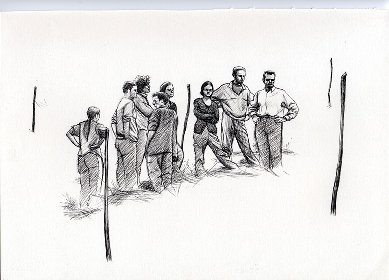
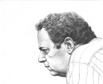
Simon Manfields blog link had been removed but I managed to find a selection of his work titled Memoria Historica. Both artists depict and report well on the issues of injustice they portray in their visual images.
Simon uses in his work very different mediums to Kentridge. Simon’s works are small and are completed mainly on paper. He uses a range of coloured pencils, ink and sometimes pilot pens to create the drawings. I include examples of his work below.
I chose the first drawing as it is not so detailed or defined. Nevertheless it shows the workers involved in the excavation for the remains of bodies. There is a real sense of seriousness and sadness as they look upon their findings.
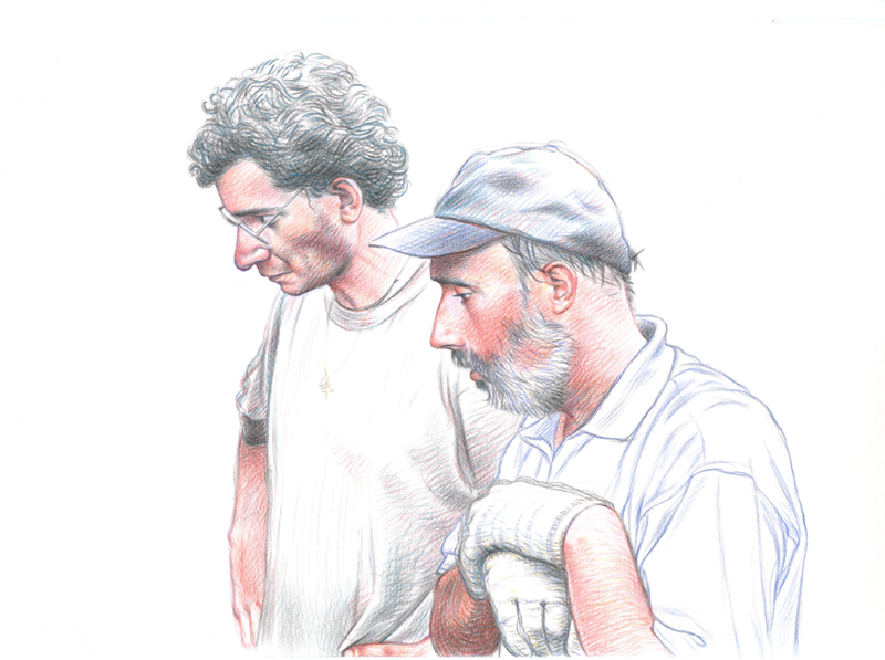
In the drawing below in coloured pencil the artist makes good use of the white background. For example, in the hair hat and clothing.
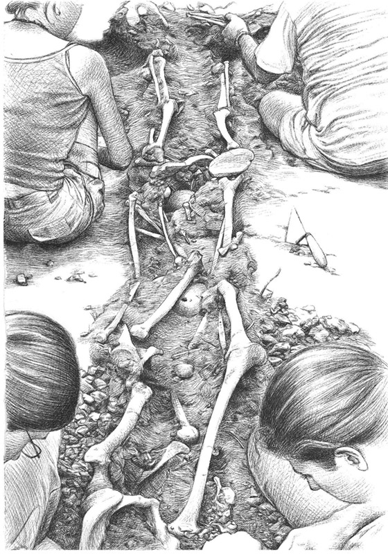
The image below captures a resounding victory or milestone in the journey of the excavation. I really love how the artist has the shape and form of the faces and expressions through the use of line.
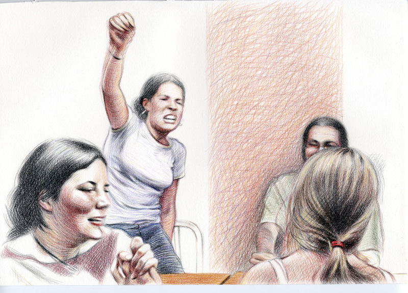
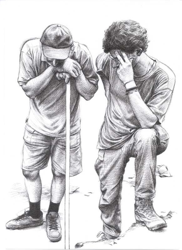
On the faces below we see more line, the use of the background white paper and cross hatching.
William Kentridge
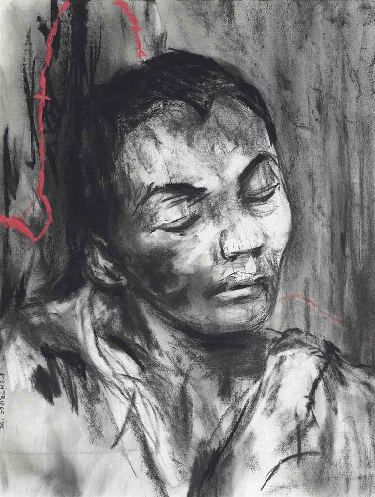
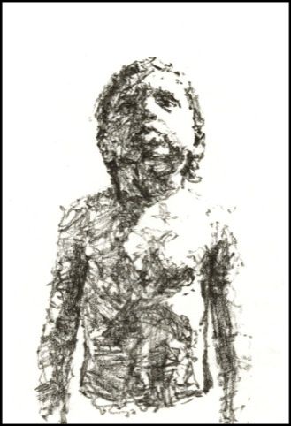
I have already researched William Kentridge’s work when I was on POP2. Kentridge and Edward Hopper have inspired me to pursue the style of work I’m currently doing and the projects I wish to complete. As I researched a little more of Kentridge, I came across the drawing below. I just love this beautiful image. In some ways it looks very simplistic. He lets the charcoal smudge and smear, and the hair peak looks roughly drawn. However, the face and the features are beautiful making great use of the dark and light tones to almost sculpt the features. I really want to use some of these techniques and how he varies the line in my portraiture.
What is really impressive about these artists is the fact that they don’t jump up and down or throw objects at paintings or works of art to make their point. They do however through their drawings and their art, help raise awareness about injustice. They are activists in my view but through capturing images and their reportage of what is really happening or has happened to people they do help people to reflect on issues and can influence change.
George Butler
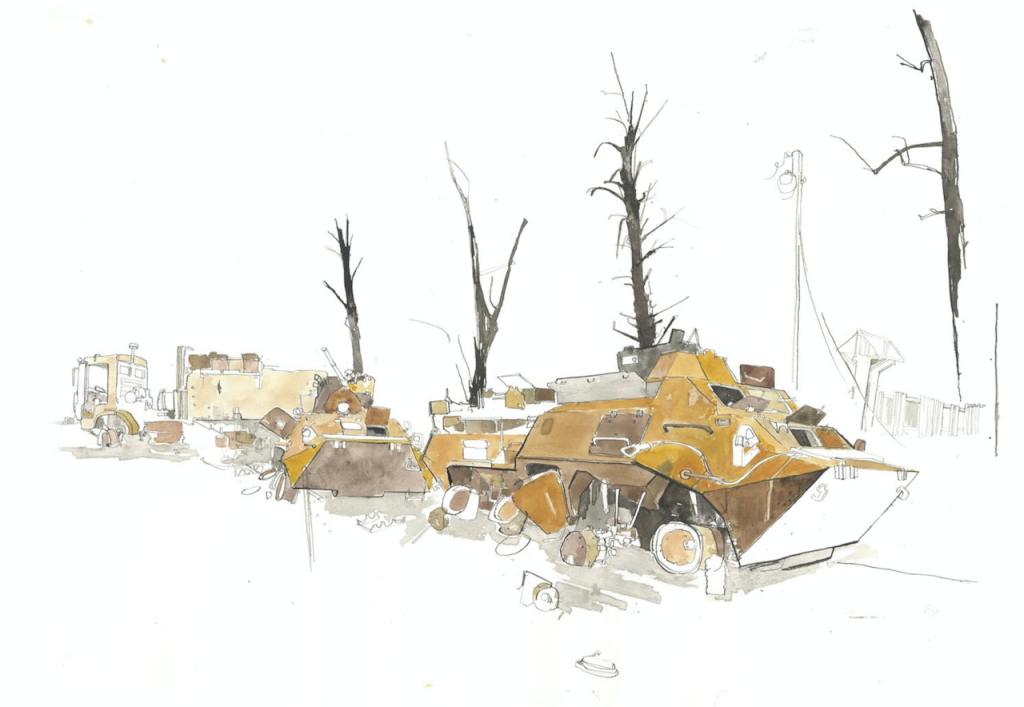
In our introduction we were introduced to the artist, George Butler and his reportage of Syria. I googled the artist and came tohis website. His work is compelling, and he captures the images in exquisite watercolours. I have included some of the reportage images from the Ukraine.
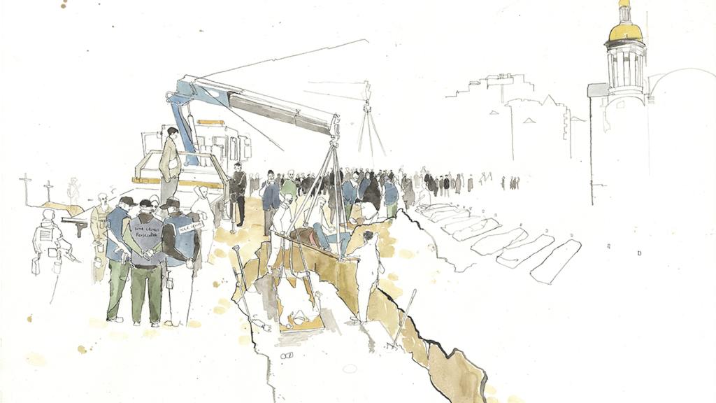
As I look at his drawings, I notice that some of the figures only have outlines. This to me reflects them being dehumanised by the events. We also see shapes of what must be bodies on the right.
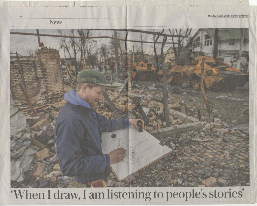
I’ve included this image as it looks like the one, he is completing in the photo in the telegraph.
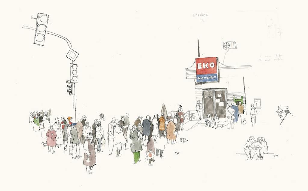
The above image reflects the many scenes we saw on TV where people were queuing for basic provisions.
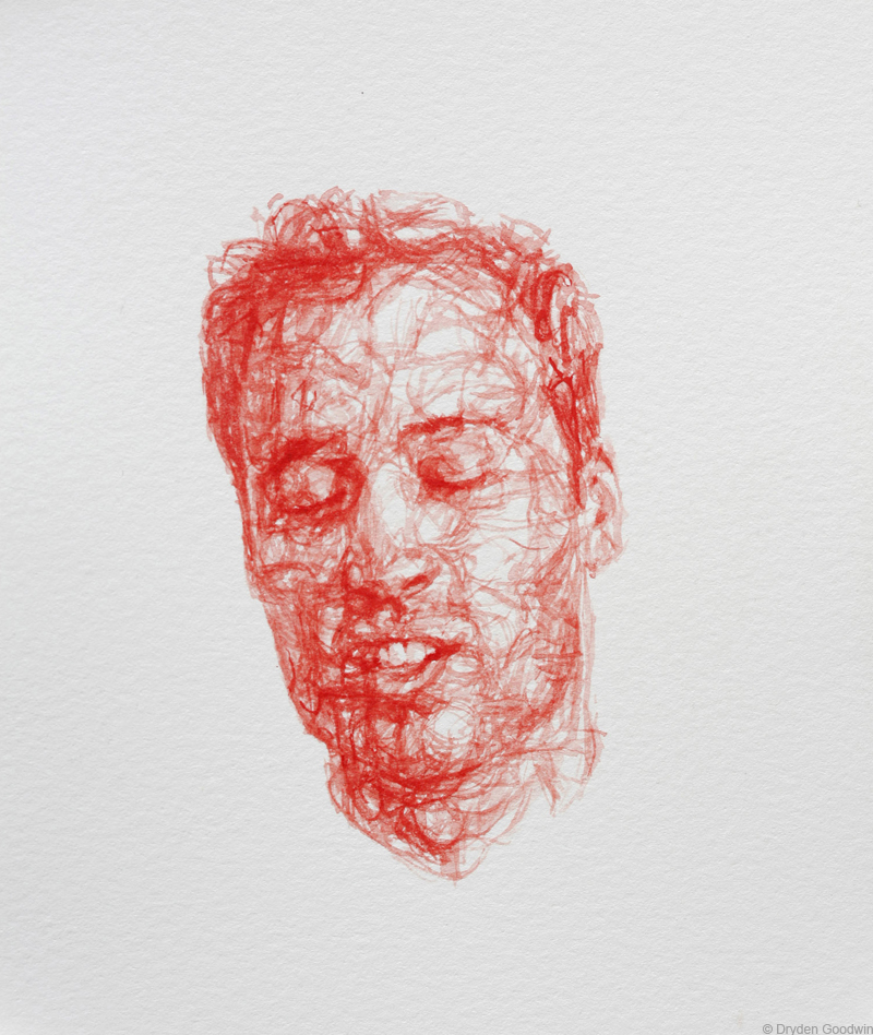
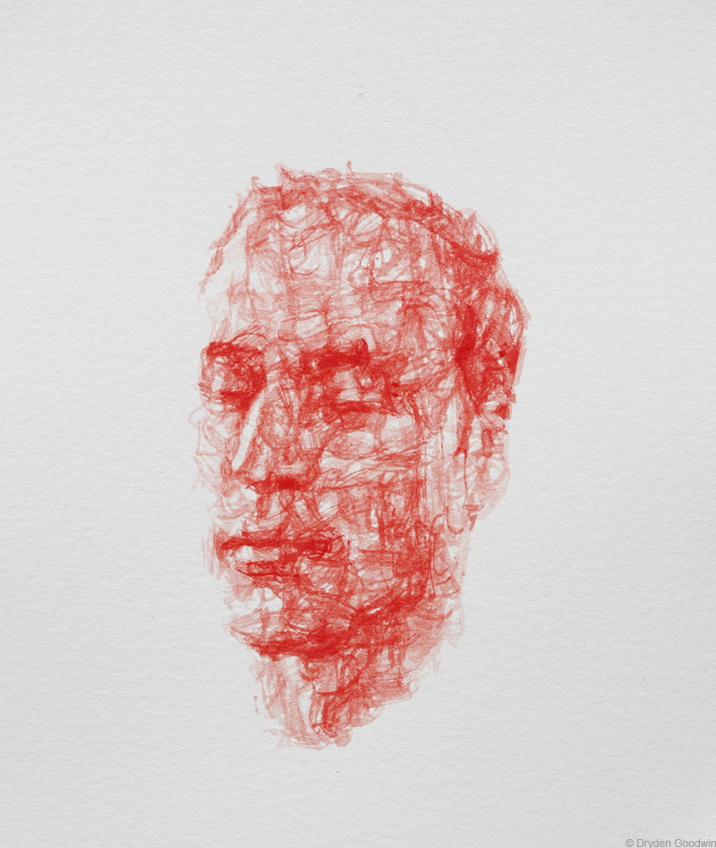
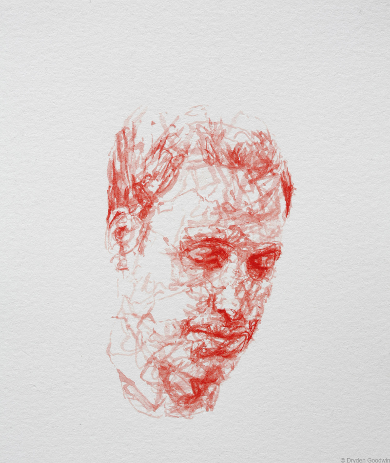
Research task – Dryden Goodwin
I watched the video the artist had made titled Breathe 2012. I found this at http://www.drydengoodwin.com/breathe.htm. I watched a video of his son breathing on a video mounted opposite the Houses of Parliament. A photo of the image is below. The drawings are compiled together to create motion and you can visually see the child breathe. The video of the installed video lasted five minutes.
I really love this artists approach and what he says about his drawings. I love his honesty about how he draws and what it means. Although the subject may be before us and as artists, we are privileged with their presence, how we interpret their feelings, emotions and their persona is quite unique and individual. We must treat any subject with sensitivity and respect.
I downloaded images of Prince Williams portraits as those are recognisable and the likeness is important. I really love the style of them and the poses. He has captured the mood and expressions so well. Dryden mentions in our handbook, developing your own knowledge of the subject and how the act of painting helps explore a sense of ‘insight and connection.’ This is so true and it becomes such a really intimate encounter.