In painting 2 I thoroughly enjoyed some of the working with text, use of language and the play on words that some artists use.
Project 1 An individual vocabulary
Research Task
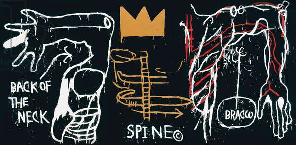
Basquiat
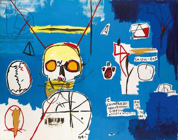
Jeanne-Michelle Basquiat was a black American artist who sadly died of a heroine overdose when he was only aged 28. I initially googled the artist to find out more about his work. He was apparently a friend of Andy Wahol’s. Basquiat’s work become hugely popular in the late seventies and there is a website dedicated to his work and legacy. One of the characteristics in his early work was to celebrate black people by using a three pronged crown. This denoted royalty or a majestic heritage of the people he highly regarded. The crown is featured in the third and forth work below. The other characteristic was skulls or heads in various forms.
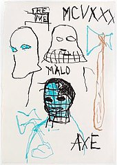
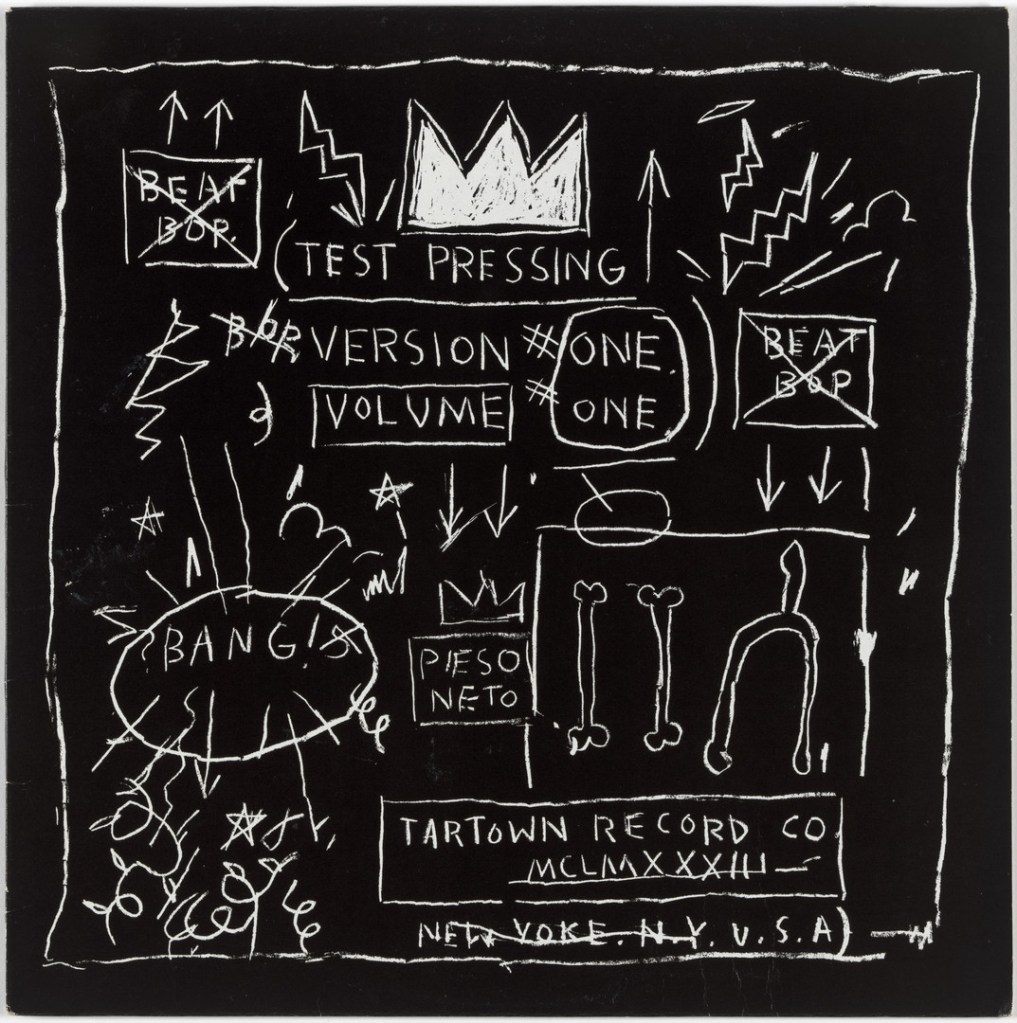
I include this text work as Basquait was known for writing and then crossing out text. On the MOMA website there is a quote by Basquait about this which states. ‘I cross out words so you will see them more.’ I think this can be so true as you look again at the words to figure out why they must be crossed out. I do plan to do this in one of my ideas for level three. I did think of doing this before seeing Basquait’s work and this helps reinforce using it.

His work contained a range of media including printing in, acylic paints, oil sticks, xeroxed collage and graphite.
Twombly
As I researched the work of Cy Twombly I was quite intrigued by comments made about his work. I made sure first that I considered the work titled the four seasons. What he captures most beautifully is the colours of each season. He painted the four seasons using a range of materials which includes oil, synthetic polymer paint, house paint, pencil and crayon. Although I tried as suggested to obtain the images from the Bridgeman library I couldn’t find them. I obtained the images instead from the MOMA website. https://www.moma.org/collection/works/80085
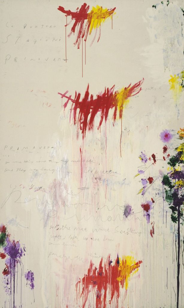

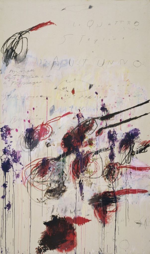

The four seasons each contain some text, dripping paint techniques and quite dramatic use of bright colours. Similarly to Basquiat’s work there are some areas that give the impression of what a child might produce. I’m really keen to explore his work further as I want to understand it more fully. It is so easy to gloss over an artists work without fully exploring any meanings or indexical links. I came across several statements about his work and explored these further. The inscriptions on the four seasons paintings togive us clues as you can see some of the writing clearly indicating or stating winter and autumn.
In an essay in the catalogue to the 2011 Dulwich exhibition (see below), Katharina Schmidt summarizes the scope and technique of Twombly’s œuvre:
Cy Twombly’s work can be understood as one vast engagement with cultural memory. His paintings, drawings and sculptures on mythological subjects have come to form a significant part of that memory. Usually drawing on the most familiar gods and heroes, he restricts himself to just a few, relatively well-known episodes, as narrated by poet-historians, given visible shape by artists and repeatedly reinterpreted in the literature and visual art of later centuries … His special medium is writing. Starting out from purely graphic marks, he developed a kind of meta-script in which abbreviated signs, hatchings, loops, numbers and the simplest of pictographs spread throughout the picture plane in a process of incessant movement, repeatedly subverted by erasures. Eventually, this metamorphosed into script itself.[26]
However, in a 1994 article Kirk Varnedoe thought it necessary to defend Twombly’s seemingly random marks and splashes of paint against the criticism that “This is just scribbles – my kid could do it”.
One could say that any child could make a drawing like Twombly only in the sense that any fool with a hammer could fragment sculptures as Rodin did, or any house painter could spatter paint as well as Pollock. In none of these cases would it be true. In each case the art lies not so much in the finesse of the individual mark, but in the orchestration of a previously uncodified set of personal “rules” about where to act and where not, how far to go and when to stop, in such a way as the cumulative courtship of seeming chaos defines an original, hybrid kind of order, which in turn illuminates a complex sense of human experience not voiced or left marginal in previous art.[27]
Together with Rauschenberg and Jasper Johns, Twombly is regarded as the most important representative of a generation of artists who distanced themselves from abstract expressionism.[28]
I do like some of Twombly’s work and I can appreciate what Kirk Varnedoe says about the method and processes being of prime importance to understanding the work.
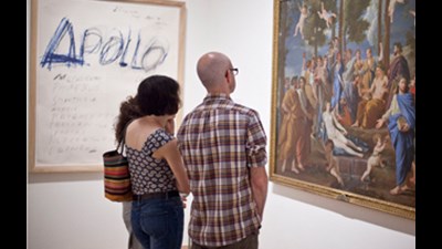
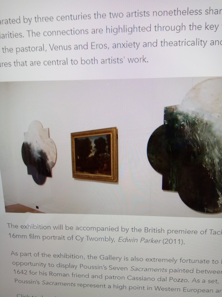
As I explored the Dulwich Picture Gallery website I came across the 2011 exhibition which included Cy Twombly and the work of Poussin. Both were being compared to one another albeit centuries apart and the exhibition focussed on the similarities in their work.
The gallery page is https://www.dulwichpicturegallery.org.uk/Search?term=cy+twombly
Also the website was a short video about the comparisons and I was able to watch. Twombly was really inspired by Poussins work around the greek gods and myths. He emulated in his own way and style such works. On the website there is a quote by Twombly. ‘I would like to have been Poussin in another if I had a choice in another time.’
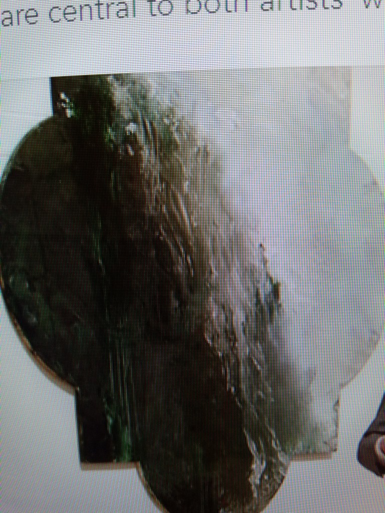
The video compared the two artists works. While Poussin was reported to be a classical and very controlled painter who’s works were quite cool. Twombly’s work was described as more expressive and immediate. However the similarities shared were about the two being of the same age when they went to Rome at age thirty. Poussin’s painting of The Roman Road below was about capturing the contrasting light through the use of colour.

Two of Twombly’s paintings flanked this and the curator who was unnamed considered how Twombly also captured the light in a similar way despite using very different methods and style. In contrast Twombly’s work was painted thickly and sometimes with his fingers. I managed to take a photo of the painting of Twombly’s below.
I downloaded a couple more of Twombly’s works that are just sublime. There’s sadly no dimensional or title details but to me they have an oriental feel and evoke an emotional response through such beauty and depth.


Both Basquiat and Twombly use the text to good effect that enhances and adds mystery to their work.
Rose Wylie
I just loved looking at Rose Wylie’s work. She has such a sense of humour which is good to see. I’ve included one or two images below from the Serpentine Gallery.
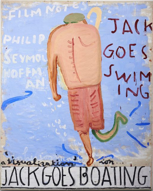
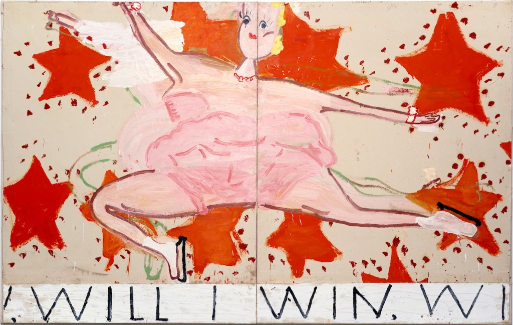

I just love how anything goes with this artist. The shapes of bodies can be contorted or have no necks. The work is just so playful. Although quite comical she is also a very serious artist and some of her work can have very poignant messages. In the video interview about her work a lot of it is created through memories of events, places and situations. She makes use of every day life occurrences and transforms them on the canvas. What was also striking was the very messy studio that she works in there was a picture on the Serpentine Gallery site of her work shoes covered in thick layers of paint and there was paint times and paint piled high. I’m so glad I saw someone else that works in a messy place.
Research Task Visual Language.
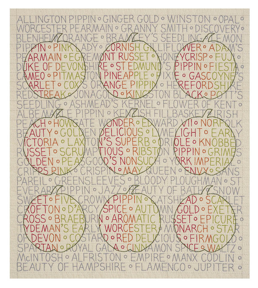
The artist I’ve chosen as one I admire is the work of Sarah Impey. Although in contrast to my work, she works in a materials using stitching and quilting for her work. I love how she has very poignant messages but they are delivered in a very sensitive and readable manner. The material helps reinforce the words. This first image is quite powerful about war and in my view man heading towards his own destruction. The black hole is very appropriate.

I particularly was drawn to the apples as I was working on fruits and the landscape. The text is about the different varieties of apple and there’s very distinguishable apple outlines.
There are so many truths here. It’s full of poignant messages raising awareness of different issues about the media in our every day lives.
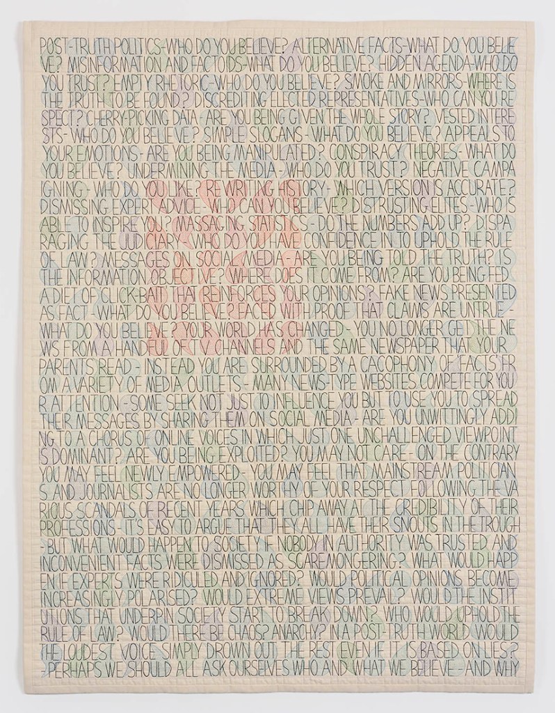
Above all I like the very humane approach to raising awareness of important issues. The artist delivers the messages in a very sincere manner that raises awareness rather than making confrontational statements. In the above work I like how she splits a word if there isn’t sufficient space on the quilt to continue with the full word. I think this also help the reader to focus on what is stated. What I will take from this artist is the sensitive manner in which words need to be conveyed. I do hope to use text alongside visual drawings as I work on the parallel project and towards level three. In this regard I have made a start on my project which will have two themes. I will discuss this further with my tutor.
Project 2 Inscription and Traces
Research task Trace Artists
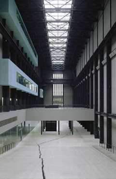
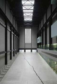
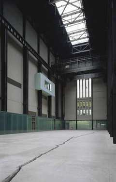
I found the work of Doris Salcedo really inspiring. The idea of the fissure in the floor or ground and putting this in a gallery setting in my view is excuse the pun, ground-breaking! I can imagine being there in the huge hall and being immersed in the invoking emotional impact. As I listened to the video and the comments made about the work I did find the whole thing quite emotional. She explained how the piece was about crossing borders and the extreme racial hatred experienced by immigrants. I watched the video about the work titled Shibboleth. The photos of Shibboleth 1 to four are below.

Ingrid Calame
I was quite inspired by this artist, her grit and guts in creating such beautiful paintings. She and her team go out and can make large scale tracings of mainly the floor of places and whatever marks are present. It is clear from reading her comments that she is a fan of Pollock and she refers to the indexical or scientific quality in his work. Whilst his marks were very sybolic of the environment and the world around him Calame’s mark making is also about a similar terrain and landscape. Some of the endless tracings, marks and mappings are then turned into paintings that are painted on aluminium panels and made with aluminium paint. Both the maps and the paintings are exquisite. I love how she uses the maps and the overlays are clearly seen in the painted work. In this regard the paint is quite transluscent.
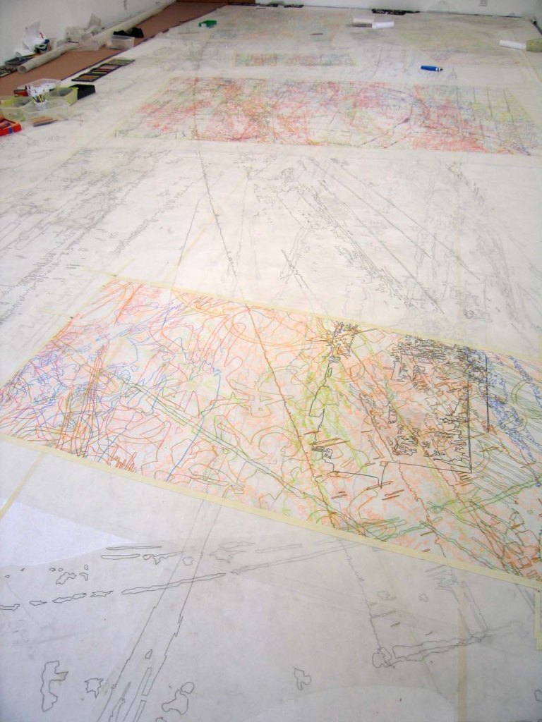

The above two images provide a sense of scale in the work she does. The traces and maps are in the first image. You can also see in the second image how she places her colour palette on the wall at the side of the painting. Her work is at http://www.ingridcalame.net/texts-by-calame-2
Project 3 Research Task
Axel Malik
Axel Malik’s work really does have energy and the images of his text provide great interest and intrigue. The text is described in our workbook as meditative scriptural. I can see how the text could be meditative as its continuous and meaningless so there’s no particular script or signs to follow. The text does seem to be hieroglyphic or coded. What is fascinating is the sheer scale of all the text. I took the images below from the artists website https://axel-malik.de/en/homepage/


The above diary is one of several. All individually marked and all marks unique. Although the work looks as if it might be repetitive it’s not. I can only applaud the patience and tenacity of the artist to create such beautiful text and so unique. Years worth of work.

As I explored the website further there are archive photos of larger works including installation of large text with use of light boxes. The works above are wall hangings. What was also fascinating was some audio sounds of him writing the script. The speed at which he writes you can hear every scratch and mark in a voracious manner.
He describes his work as The writing process consists of individual, sign-like characters that never repeat themselves. These traces of movement possess the character of complex lines pertaining to a sphere of motion marked by continuous progressive differentiation. The result cannot be read, or certainly not in the customary sense of the word.
Drawing with Purpose Chapter 7
I really enjoy this series of writings about drawing. Nigel home suggests that when we draw there is a gap between seeing and drawing. Although the gap might be momentary or much longer we are then drawing on memory. This is so true when I consider drawing something in front of me or when attending a life drawing class. You look at the figure and it’s the memory of the line or mark that you are putting on the paper. There were examples of graphic are used as instructional drawings. He also mentioned the cave drawings and how those that made them represented and interpreted what they saw to leave a legacy to teach others. What also resonated with me was the fact that although we try to represent an actual scene of object, what we put on the paper is unique and will have an importance all of its own. This series does make you think more about the processes and purpose in every mark. Even text will be intentional in making a statement.
