Exercise 2 Picturing words
For this first warm up exercise I chose a passage from a book I’d read by a Devon writer, Marcia Willet. The book is called The Songbird. Although a random book I chose a passage with some good descriptions. I find that good descriptive accounts in a book really help engage the reader and we automatically visualise in our minds how the scene might be. I particularly enjoy this writer as the books have a really feel good factor and I am sometimes familiar with the places in Devon that she writes about.
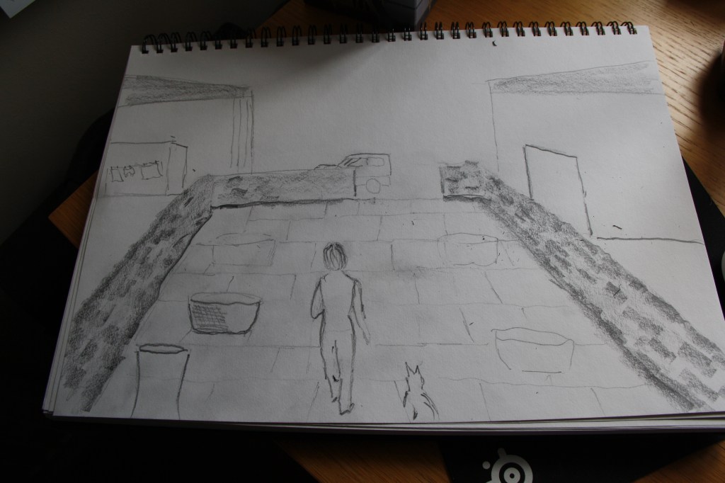
Charlotte opens the front door and wanders out into the courtyard with Wooster at her heels. Last autumn she and Andy painted the old wooden tubs they found in the stables and planted them up with bulbs: snowdrops, daffodils, crocuses and tulips. Now in the late March sunshine the daffodils make puddles of golden light all amongst the flagstone walls. The big open-fronted barn to the north of the yard is empty except for her own little car, and a line of washing hangs in the sunshine in the south facing barn where the logs are stored.
I drew in the main outlines of where places and objects would be. I could visualise the dog at Charlotte’s heel as she walked out so I could either picture her outside in the courtyard or I could include in the image the doorway leading out. I decided on a quick sketch of both but would see which worked best. My images are below. The one element that I wanted to capture was the puddles of golden light along the flagstone walls but to do this I think I’d need to use paint. My use of perspective lines give an aerial view feel as if looking down on Charlotte and the dog.
My first outline sketch I used a 2b graphite stick. For drawing or sketching I find I use watercolour brush pens, pencils of various hard and soft grades and sometimes coloured pencils. I also use biro and although unforgiving I do feel quite confident with it. Since considering Barbara Walker’s work and William Kentridge in POP2, I am also drawn to some charcoal/conte crayon work and want to explore this more.
For my chosen memorable book I’ve considered Oscar Wilde’s The Happy Prince. I think I read this very short book in my early teens and it’s meanings and messages therein, have always stayed with me and been important. The book although a very fictional and imaginative tale, is about love, acts of selflessness, compassion and generosity of giving in many ways.
“Far away,” continued the statue in a low musical voice, “far away in a little street there is a poor house. One of the windows is open, and through it I can see a woman seated at a table. Her face is thin and worn, and she has coarse, red hands, all pricked by the needle, for she is a seamstress. She is embroidering passion-flowers on a satin gown for the loveliest of the Queen’s maids-of-honour to wear at the next Court-ball. In a bed in the corner of the room her little boy is lying ill. He has a fever, and is asking for oranges. His mother has nothing to give him but river water, so he is crying. Swallow, Swallow, little Swallow, will you not bring her the ruby out of my sword-hilt? My feet are fastened to this pedestal and I cannot move.”
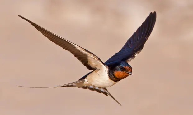
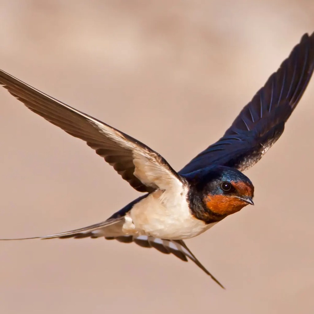
The full version of the Happy Prince is under the section on Books as it’s only a few pages long. The text above is spoken and described by the Prince as he asks the passing swallow to help in improving the life of the sick boy and his mother. I quickly used a fine line ink pen to create a first very linear drawing of what the Prince can see. I feel it’s important to use the window and frame. The small picture in the room meant I could use the swallow. I shall draw the swallow as the hero. My Prince I shall also draw but as he is in the beginning in all his finery and jewels. Once my first idea evolves I can be prone to get carried away. I may try to paint my swallow in egg tempera on wood. I’ve thoroughly enjoyed using this medium. I download a couple of images of the bird as I’m not entirely sure what a swallow looks like. What a beautiful bird!
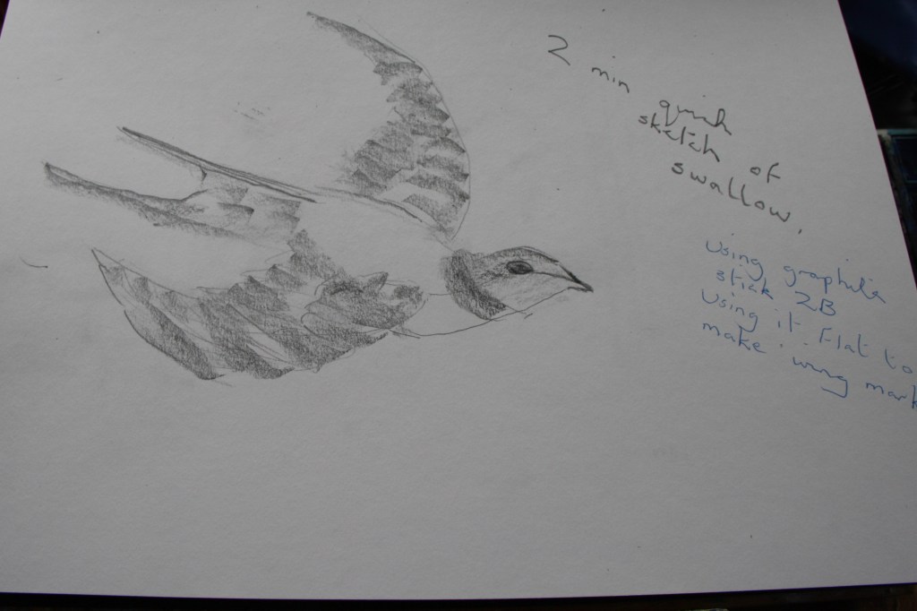
I do a quick sketch of the bird below. I just use the flat of the graphite stick to make wing marks and work quickly to define the wing shapes and outline of the bird. Working quickly usually helps me to be more accurate in capturing what I see.
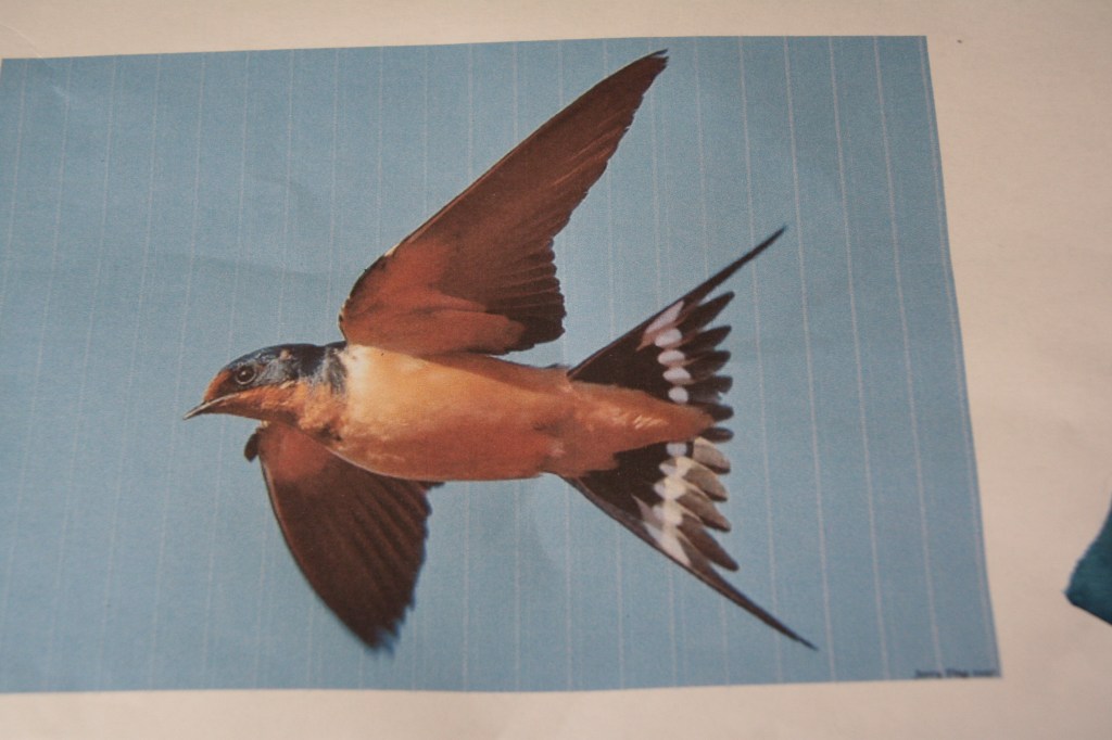
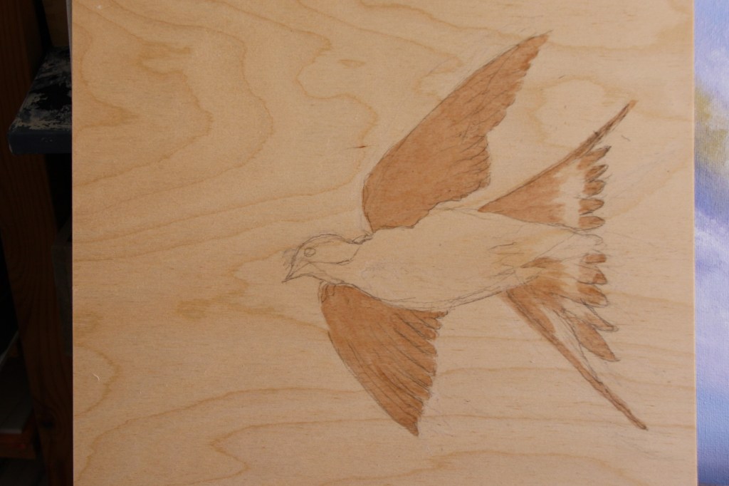
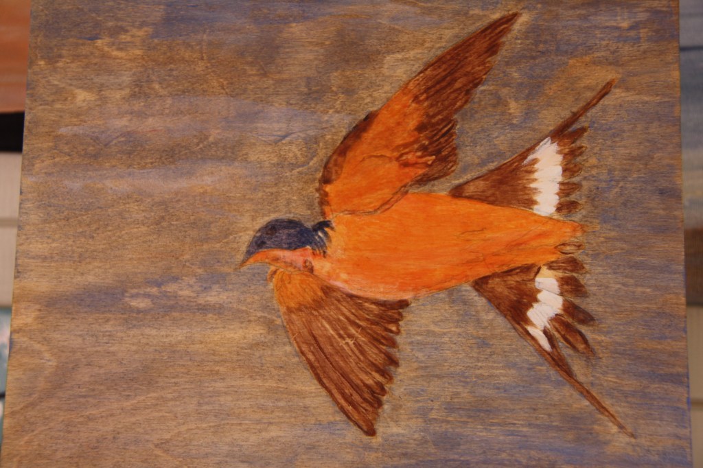
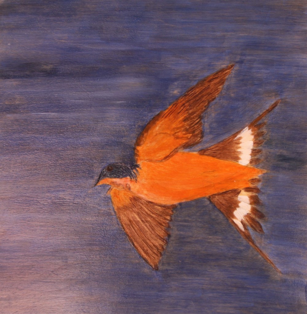
I want to do more work on the bird as the swallow is such a beauty. I wasn’t that familiar with the swallow until now and looking deeper at this story. Having become a little hooked on egg tempera I decide to draw the swallow in this medium and to use another medium I’ve not used before as my support. I have a wooden panel of plywood of 12x12ins in size. I purchased this from hobbycraft so will try it. I decide to seal the panel with an mdf/wood sealant as I don’t know how porous it might be. The first outline sketch is below with one layer of tempera on his wings. I mixed up my yellow with rose madder and a little ultramarine to make the brown. I shall gradually build up the colour in each area systematically and see how this works. I’m relatively pleased with the sketch. The photo I used is below.
The image above shows the bird with colour in all areas except the mid tail which is white. I’m not sure how the egg will mix with white. The other areas have received a couple of coats and I’m beginning to like how the layers are building up. At this stage I’m not sure what to do about the background. I would ideally like to use the wood grain effect as the shapes of clouds so whatever the colour I don’t want to necessarily go too dark. I guess I could just leave it the natural wood colour but I need to push the boundaries a little and see what I can do with a panel.
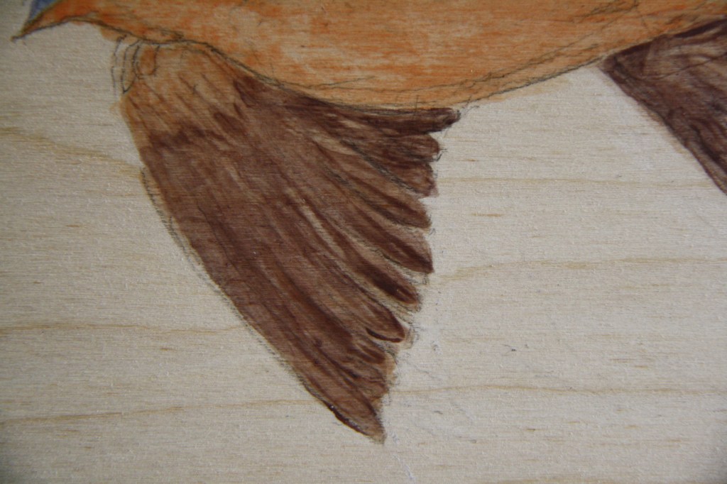
Above is a close up of a wing. I love how the tempera creates the translucent feel.
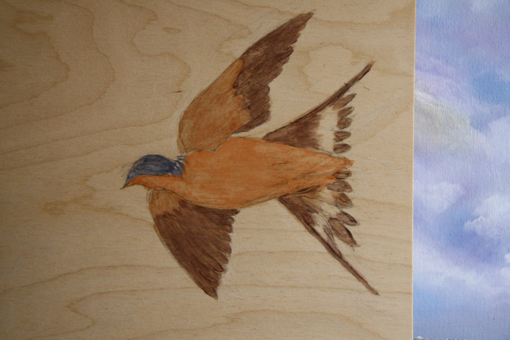
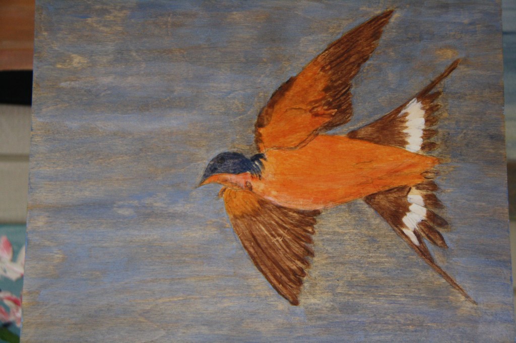
The above photo shows my bird more fully painted and I used the white. I was fortunate enough to attend a workshop on assessment with Caroline Wright. I was able to ask her about the use of white and it amazingly is okay. While it may look a murky colour when you mix with the egg it dries very white. The proof is above and it worked well. I’ve got a little too much white but will overlay with the brown and shape the feathers better as I progress. I also take the plunge about the background and give the panel a light coat of grey tempera. I’m still not sure about this but will try another light coat.
I continue to build up the colour of the background and my bird. Some images are below as the bird takes shape.
Three coats of grey below and three more on my bird but the grey isn’t really touching the background. The bird is however beginning to stand out and have some form. I decide to go more blue with the background and use a mix of cerulean blue and ultramarine to overlay on the grey.
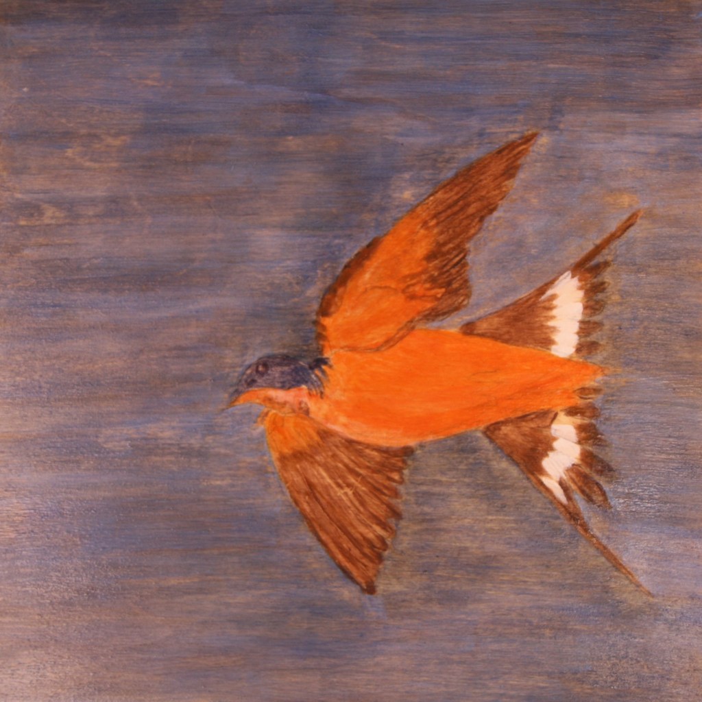
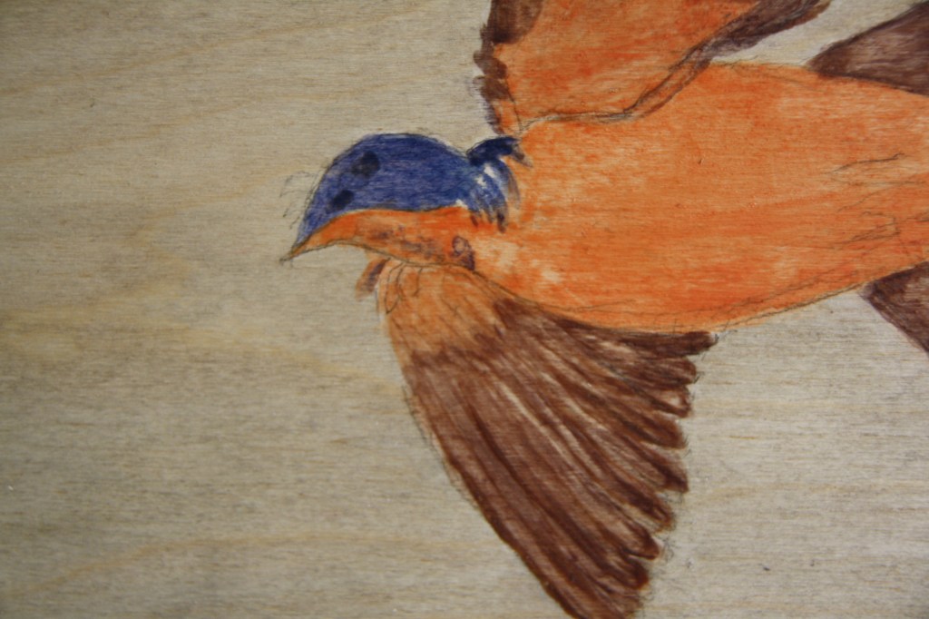
The above image is with further blue coats to the background and a bit more attention to the eye. I now want to get the backround improved now I’ve gone dark and there is a little mark on the birds face almost giving him two eyes. I need to remedy this. Scratching out may be an idea as I’m still new to this tempera. Alternatively I might paint over and build up the colour all over the face. I’m really loving this bird and learning such a lot about this medium. Below is an image with added more blue as I decide to stick with this. I’m not sure why some areas of the board are not covering up so well but I’m not going too bothered about it. I think it adds another dimension of distance maybe. I intend to put some white cloud in when happy with completion of the bird.
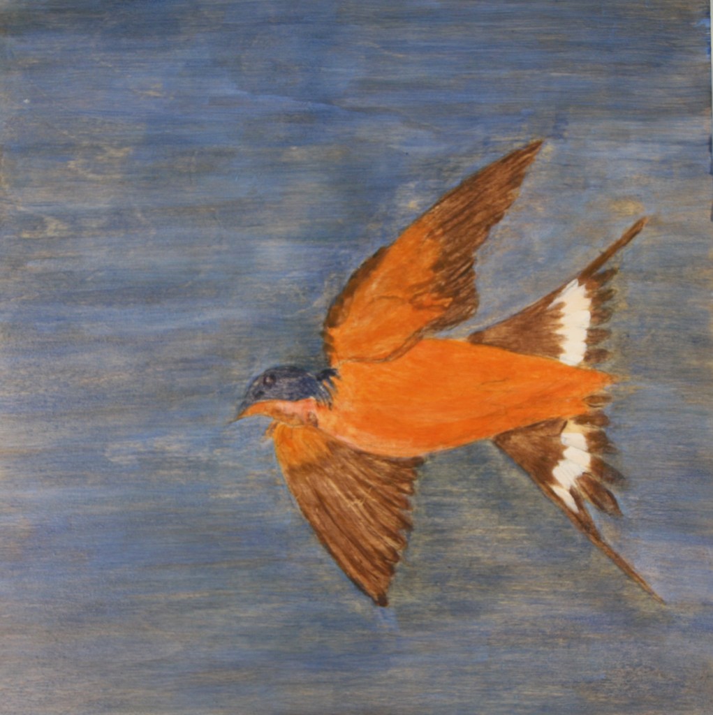
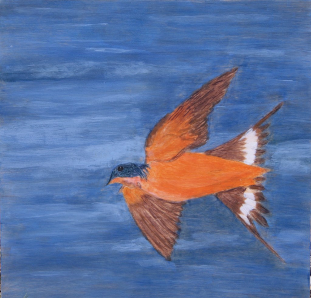
I finish the bird today. I’ve added a further coat of blue and some cloud. I’ve completed the birds face and his eye and a little more to his body. I’m quite happy with him now and I’ve just loved returning each day or two to work on him. It’s been great to work on two or three projects at a time as I’ve also got on with the other exercises. Although the bird is only part of my narrative he is without doubt the hero!
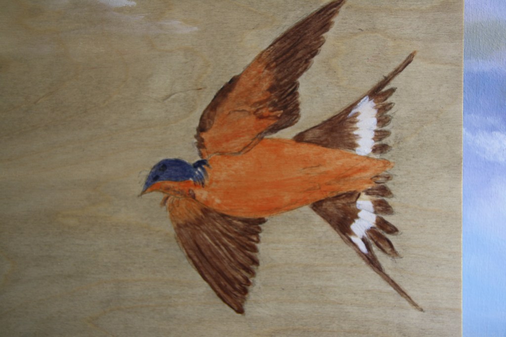
Above is my finished bird. I’ve added more ultramarine and a little indigo and white in places but still some areas of the panel won’t cover very well. I finished the face adding touches of white flecks and finished his eye with a dot of white. I also added a little more elongation in brown to the top wing. I decide not finished! I add further coat and some white cloud. I didn’t think the birds head stood out enough.
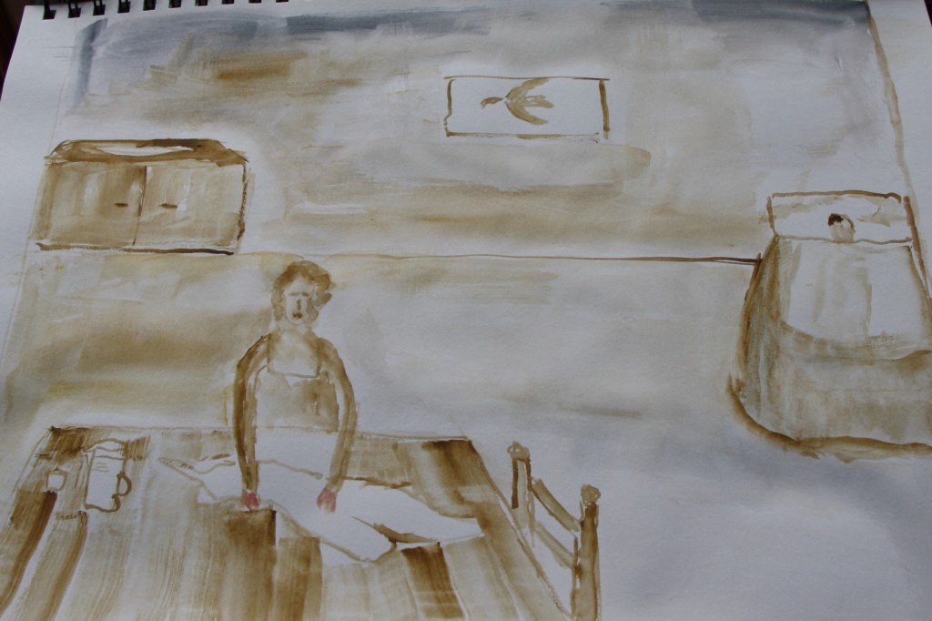
My first sketch of the overall scene is below.
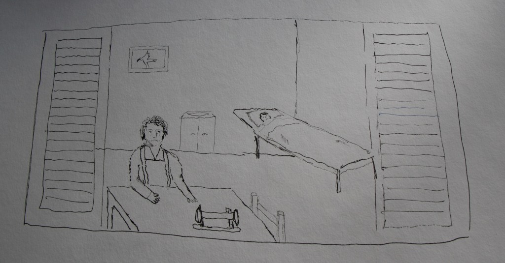
The above is my first rough outline sketch, I think she wouldn’t have the sewing machine and I should have put in the jug and water. The shutters are good to include but need some definition to make them outside on the building rather than included as it currently looks visually. I imagine the room to be fairly dark and gloomy. The room looks too big and I’m looking down a little on the table which is okay but the bed isn’t very good in regard toperspective.
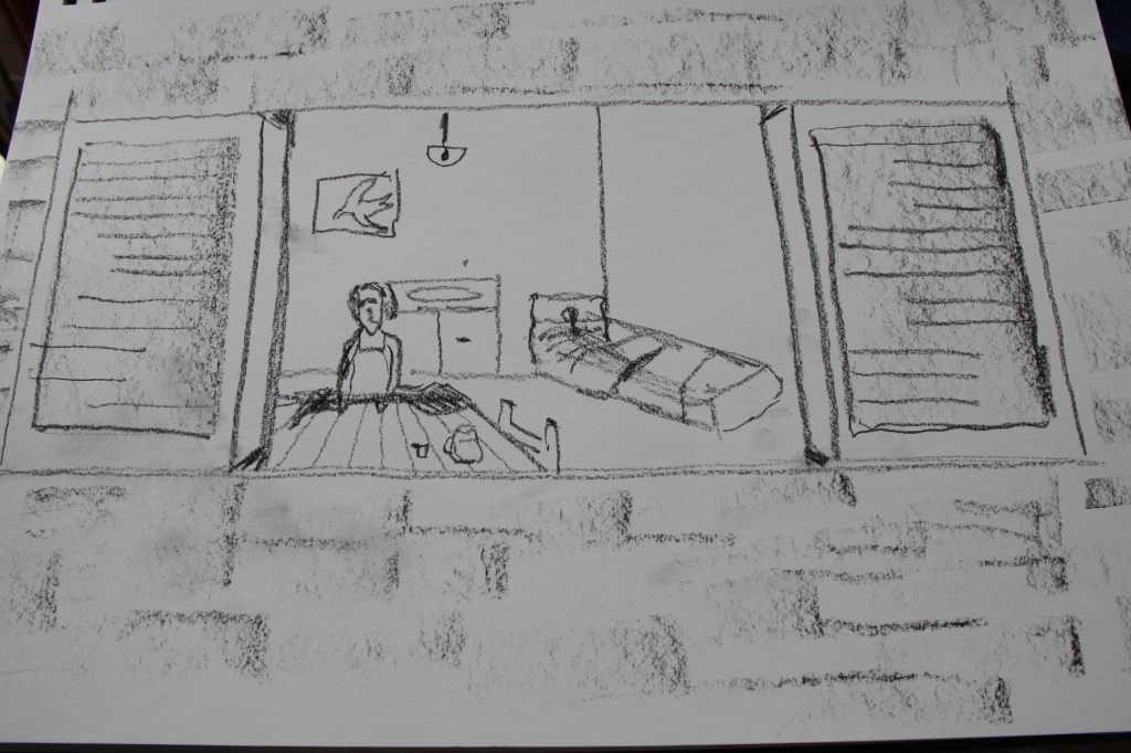
My next quick sketch of the same subject is in conte crayon. I elaborate on the brickwork a little using the side of the crayon. The bed looks pretty dreadful in regard to shape and perspective but I remind myself that artists I researched don’t alter the sketch. The bed is still not right.
My next quick drawing is below. This time I just focus on the main content in the room and dispense with the shutters.
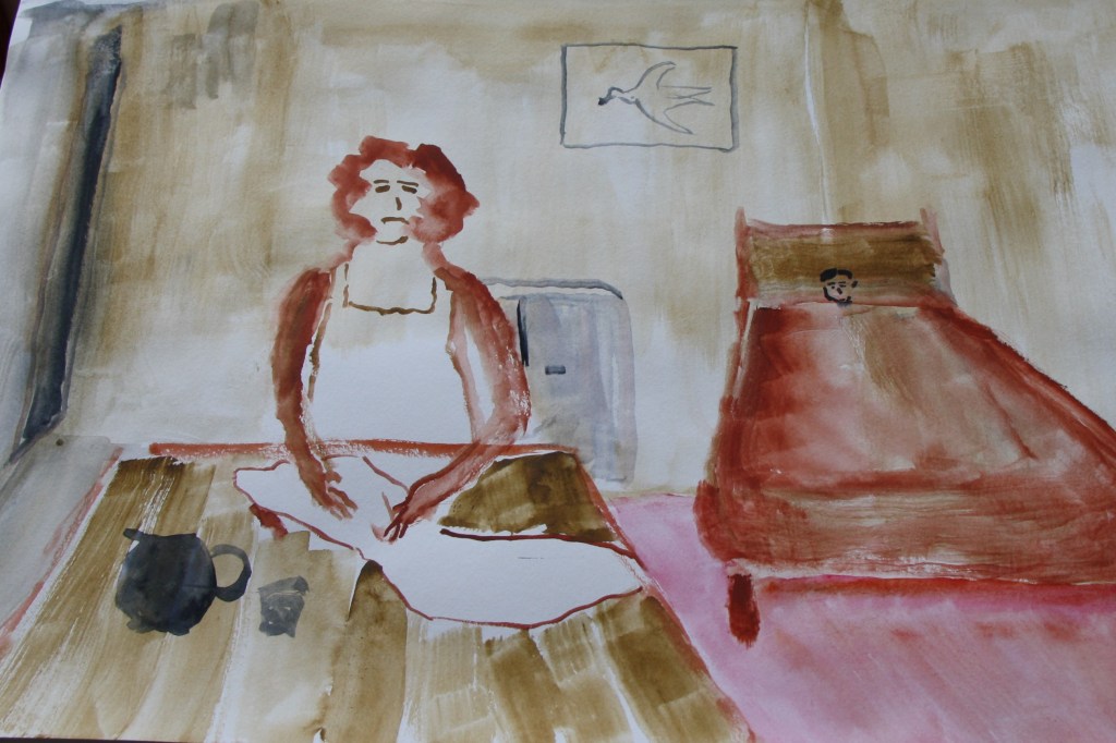
I decide to use watercolour paint this time and use a sepia monotonal colour mainly. The garment I include and the jug and water on the table. The wall at the rear I add a gloomy grey.
This next image below is including the jug and drinking vessel and I wanted to make the room smaller. A family living in squalor wouldn’t have a big room to live in. I leave the chair out so that the bed is more visible and closer to the viewer. I add in a doorway in paynes grey on the right and the bird is featured again in the picture. I like the gloomy feel and the room size suits the situation
My final draft is the scene as a whole. I try to depict an evening scene with my Happy Prince on his podium with the swallow looking out over the city and into the room with the woman and her son. I can’t help draw in the Prince in an acrylic gold liner pen.
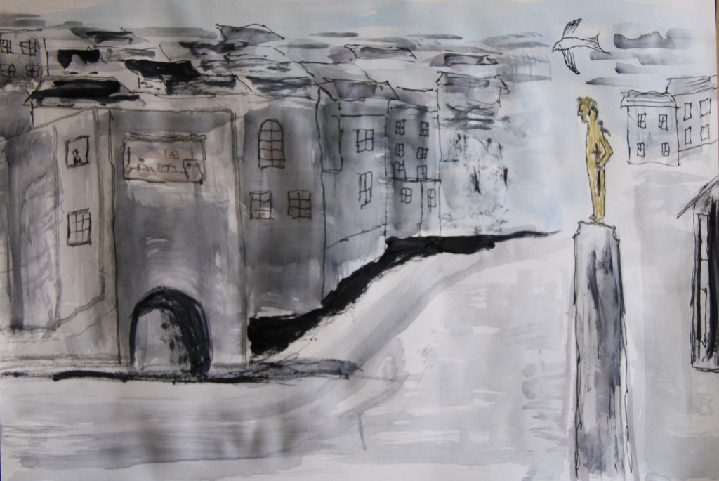
I worked quick again completing outlines of the buildings, the Prince and his podium in a black Staedtler fine liner and then I washed in some paynes grey watercolour mainly with a sponge plus one or two brushes. I put the bird on the Princes shoulder but also added another bird in the skyline. I outlined some of the rooves in the distance to create a recession and succession of buildings and an archway for interest. The large window that the Prince is focussed on I tone a little with alizarin crimson. I add dark shadow to the edge of the buildings and the archway to draw the eye and to balance up some darker tones to the rooves. I keep the colours almost monotone grey as its winter in the story and very cold. The swallow was on his way to migrating to a warmer climate.
My final work.
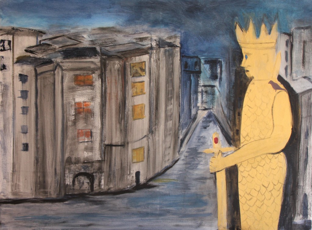
Although I wanted to paint the last indoor scene of the boy in the gloomy bedroom I decided on the latter landscape scene as it depicted more of the whole story. I wanted to paint the scene on a relatively large canvas. The one I chose is 36ins by 24ins. The advice given is to work as rigorously as in previous sketches so I shall just go for it. I would work very loosely. I wanted to use oil pastel crayons and then apply solvent to help with bleeding. This technique I would mainly use on the buildings. My Prince I would colour and paint in some gold acrylic paint I had. As you will see from the photos I had a mad moment part way through and changed the composition. My first quickly and rigorously painted canvas is below. I completed the outlines of the buildings in oil pastels and was just about to add some solvent after I’d painted in my Prince when I thought not right. Boring. I want more drama for the stars of the show. The Prince I decided would be really prominent in the foreground and the skyline.
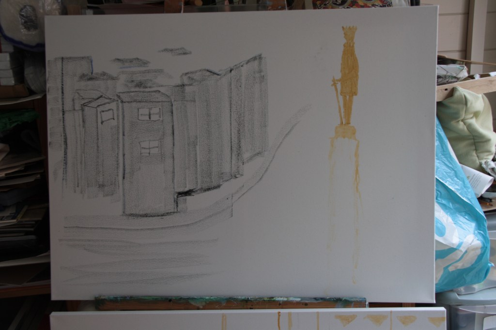
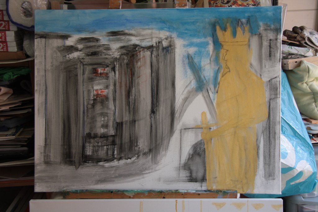
The above image shows the Prince close up and I’ve washed in with the intended zest it some of my drawn in marks of the building with the oil pastels. The Prince has two swords as I initially tested a vertical shape but holding it down is better. I intend to put the jewels in the sword too if I can. The bird can be sat on the Princes shoulder maybe. I quite like the effect of the buildings but I want to create the window where the boy and his mother are if possible. It’s a cold night so I hope this is reflected in the sky and the mood.
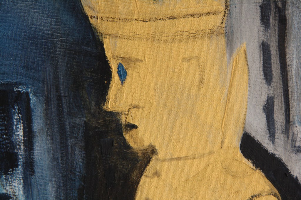
I need to refine the Prince as he has a humped back. The previous sword shape however I use as a pathway as it draws the eye up the street. I’ve adjusted the buildings a little and I do like the loose feel but the perspective although I don’t want it to be perfect I do want to follow loosely the perspective lines. If I add too much detail I risk losing the loose feel but I do want to try to feature the window with the woman and her son in the bed. I will try this but accept it may not work. In the next image I have reworked the Prince giving him a ruby in his sword and a sapphire in his eye. I’ve got him in better shape and I reworked the skyline and the windows in some of the buildings. I’ve also added some sky colour to the foreground and the right side of the painting. I also put the bird on his shoulder. I’ve included a close up of the Prince’s head and I’m leaving some of the original oil pastel marks as they help to age him a little.
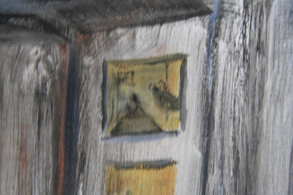
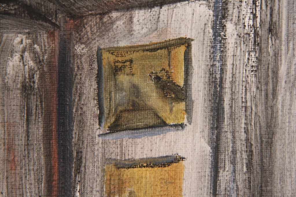
Below is a close up of the window where he sees the mother and boy albeit deliberately fuzzy.
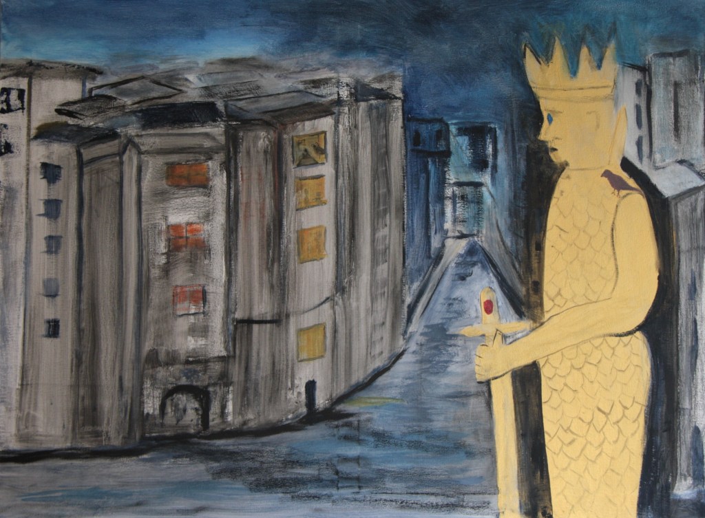
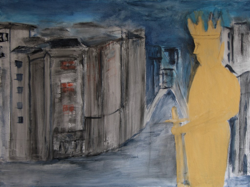
The final image is below. I feel if I work it any more I will spoil the overall effect which I guess is a bit surreal.
Reflections on working with text.
Again this exercise has been magical for me. Considering text can provide such a diverse range of ideas and an opportunity for the imagination to run wild. I guess this stems from reading a good book and you picture in your minds eye each chapter or scene. With the warm up exercise I really hadn’t any trouble in visualising the scene as I love the Devonshire coast and its rolling hills. Having again read such a lovely feel good book I felt I could easily visualise the scene. The Happy Prince story was a little more tricky as the story and the text described by the Prince was a little more complex. The narration broke down the different elements and stages in the story. Whichever way we visualise the scene I think the ultimate skill is in capturing it and transferring it to the canvas or our creation. In this regard it’s important to select the right kind of tools and materials for the painting to work. My Prince final painting almost has a surreal feel to it and working very loosely has helped create that effect. I just hope I’ve done the story justice. I tend to evaluate my work as I go.
Next day I look again and there needs to be some shadows of the buildings. I add these as below and I think it’s added a little more drama. I place some shadows of the front buildings almost coming towards the Prince. I do this with a little oil pastel on its side. I don’t want to over do it. I also redefine the bedroom scene a little as below and the final Prince is here too.