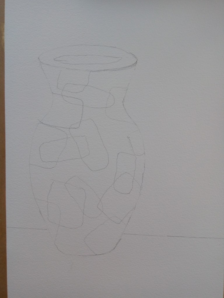
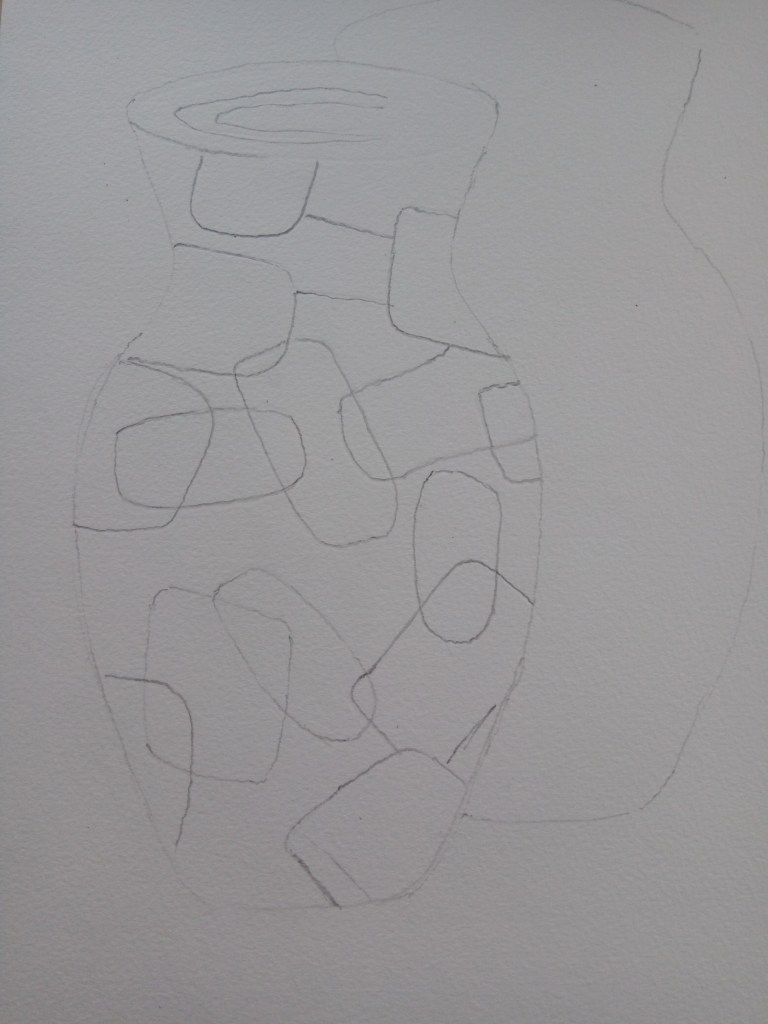
I’m loving doing this exercise. It’s really helping me to put some of my new learning into practice. When I read the question I really liked the idea of concentrating on one object and redefining it. I decided on a simple object that I could really transform and as I set about thinking of ideas some of these naturally led to thinking about what I’d learned about titles and maybe using a play on words. I recently attended an egg tempera workshop run by the head of the course, Caroline Wright, and I have been hooked on its use and properties, therefore I wanted to use the medium again on these five works. I found that the tempera had very good glazing properties and that if used thinly they were translucent and were good for overlays. I considered my object and I decided upon a simple shaped vase. I kept the vase to a simple shape as the pattern would be quite dominant, the vase colourful, and I wanted it to be robust in line with my intentions. I would use watercolour paper and I wet and stretched this before use. We had used watercolour paper in the workshop so I stuck to this. As I’m roughly using A3 size paper I am mindful that my vase will fill quite a bit of my paper but I shall be adapting my placement of the vase/vases in each of my scenes and will explain why they are placed. I mustn’t lose sight of the fact that the exercise is about pictorial space too. As my ideas began to flow I decided upon drawing up a plan for each vase but my initial task was what vase and its shape plus any pattern on it and design. I like art deco shapes and did consider quite an ornate shape of a vase I have. However I decided that in order to transform my vase I needed to have quite a robust shape. I decided to do a quick template on another piece of card. The pattern I took loosely from a vase I have. The image below shows the outline sketch of my vase and the pattern within it.
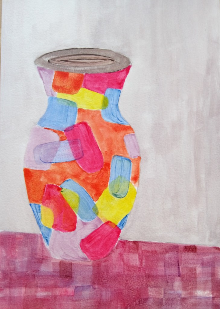
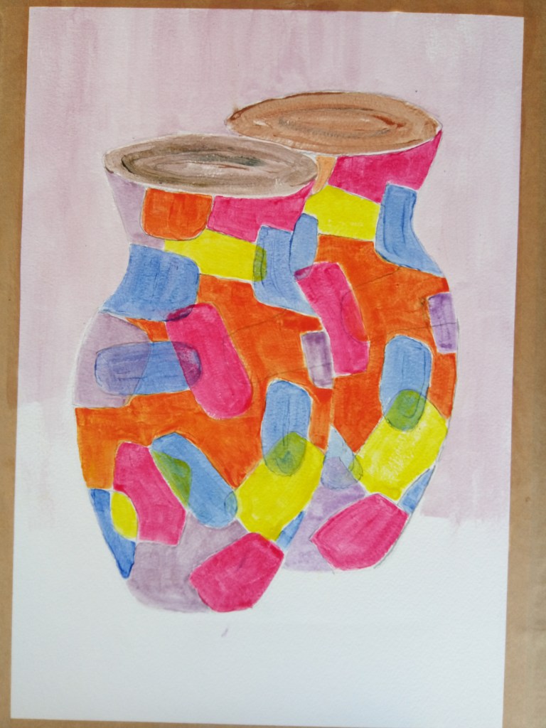
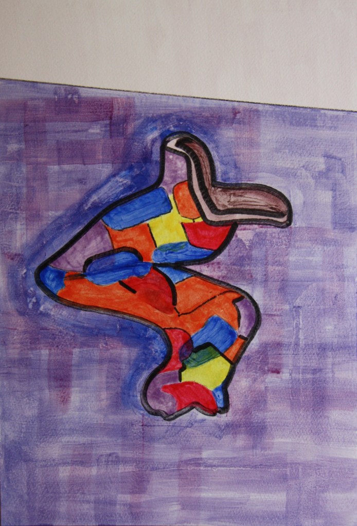
The next image shows the vase coloured in. As I was working quickly as the tempera dries at speed I couldn’t afford to stop for photos. I mixed up the tempera by using the yolk of the egg and a few drops of gin to the egg and some water. I added each of my colours to some egg one at a time when ready to apply that colour as once mixed up to apply the tempera colour can dry quite quickly. I filled in all my shapes sticking to a few main colours, rose madder, Cad red, lemon yellow, ultramarine blue and violet. For the orange I mixed the rose madder/red with the yellow until I got the right tone. What I loved is the transparency of each colour as I applied them and the sheen as the paint dries. In this regard I let the brush marks show deliberately and I glazed at least three times each colour when the one below was dry. The glazing added to the ceramic feel of my pot. I deliberately wanted to keep the background fairly bland as my pot was the main focus. I may go darker with the background in one of the other pots and this may help my vase stand out more. My table however I decided to create a chequered colourful dark tones to contrast with my pot. As I progressed I made the decision to give my shapes even a more dramatic feel by outlining the shapes in black. This was a bold decision and one that is definitely changing the whole concept of my painting. The first image shows my vase with some degree of definite shape and form. I do believe I have achieved this through the subtlety of the layering. The rim on the vase also helps the eye to know it’s cylindrical. However some of the edges I need to finish better if I don’t outline. I could outline with a light colour like putty to give it a mosaic feel. However I went with the outline.
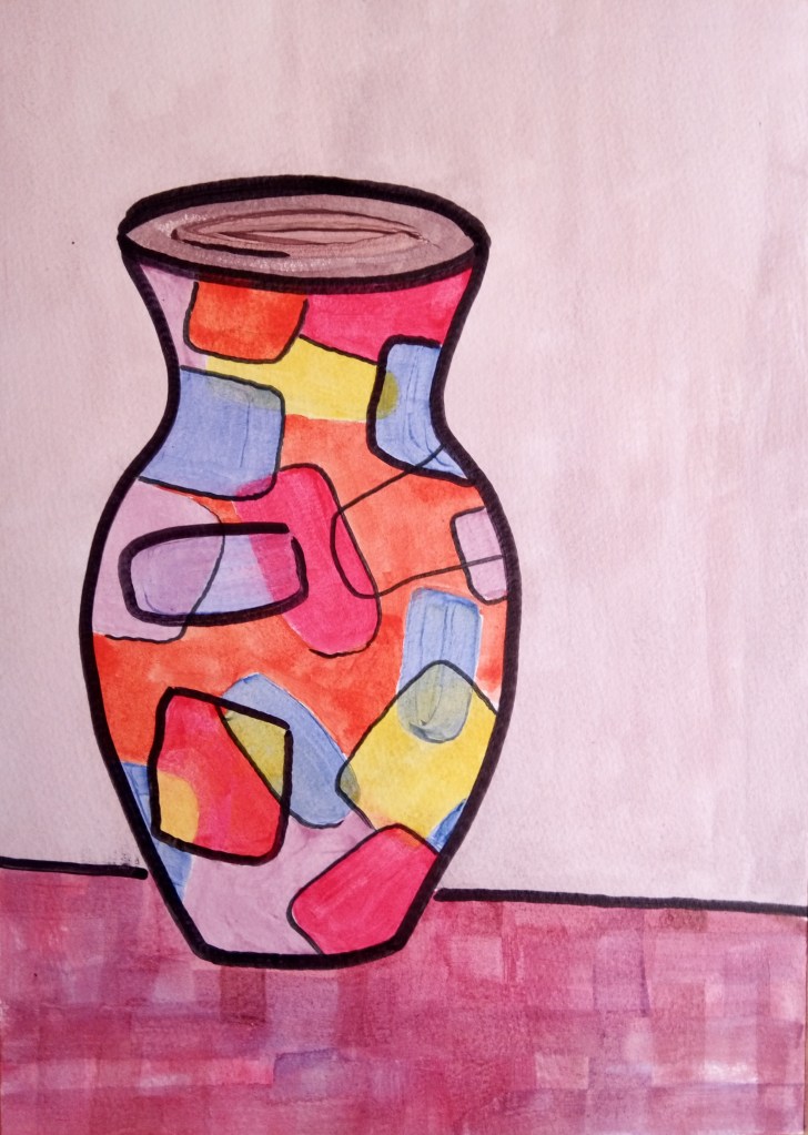
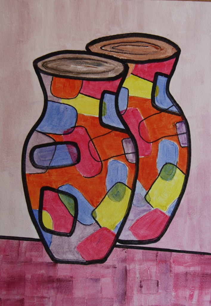
I did one or two outlines in thicker black lines and some partially lined and one or two shapes not lined at all. I was quite pleased with the effect but the outcome is debateable as the black lines do flatten my vase. I do still have the jewelled like shapes and my overlays work well but the vase is I guess more flat. However at this juncture I remind myself that I am a fan of Patrick Caulfields work and he often uses blocks of bold colour and dark outlines. A couple of his images are below.

In the above image of pots Caulfield has also been very clever with the composition as some of the vases are seen from different perspectives. For example we are looking down on the vases in the lower section and there’s recession with the ones at the top. The other artist we covered who created some flatter works with line and his perspective was Matisse. I include his red room below.
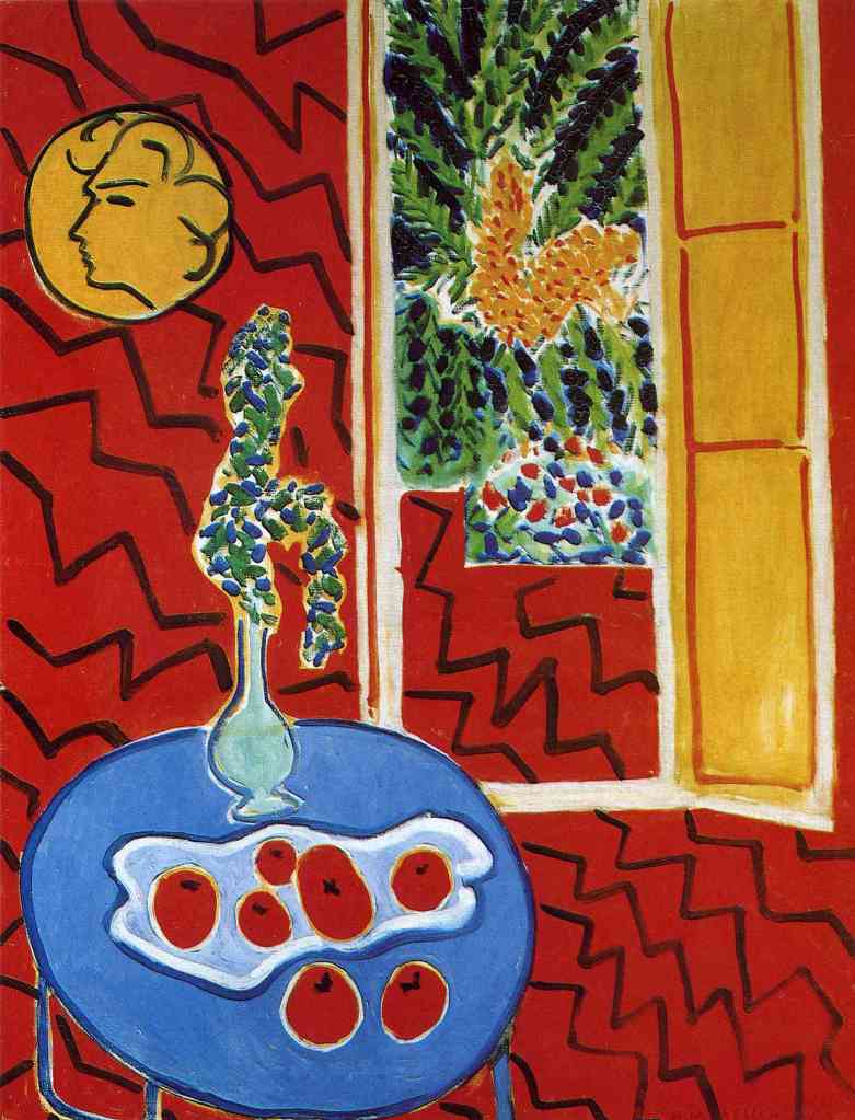
Matisse has outlined his table and its content and has created the door through outline.
I feel a little better about my composition and the decision I made, however I may still do the other vases without the lines maybe. In contrast to Caulfield and Matisse the contents of my line are more subtle and I’m hopefully creating a translucent/ceramic feel.
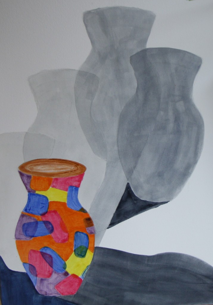
My second reimagined pot is two pots and my idea is to call it double jeopardy. The reason for this is that I am going to place the first vase at the front on the table but the second one is behind with no visible base. Its in mid air maybe? When I recently attended the workshop run by Bryan Eccleston called an Analytic of Making we covered several elements in making or four tendencies from the twelve described by Antionne . In order for me to create two pots of the same style and design and put one behind the other I decided to use tracing paper and my template. It could be questionable that if I’m using templates and tracing paper how much of this is drawing/ technical skill? Once I’d copied /traced the original I carefully placed the trace and created my first pot. I then used the same trace placing it at the side of the original and drawing it in. Below is my original pot as I begin the tracing paper exercise.

Below is my second work/painting with the outline of the second pot in place from using the tracing paper. I also used a cardboard template for the pot shape.

The above image shows my template and the tracing paper.
The above image shows my pots glazed three times with each colour. I like some of the overlays of the colours and this pot/s look a little more ceramic. As I consider the black outline again I do think now I’ve started I’ll continue and it will help define the two different vases.
The image of the pots complete with background and outlines is below.
Tragedy on the one above as the outline on the front pot is a little wonky round the edge.
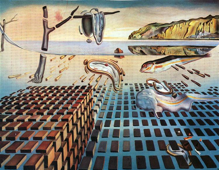
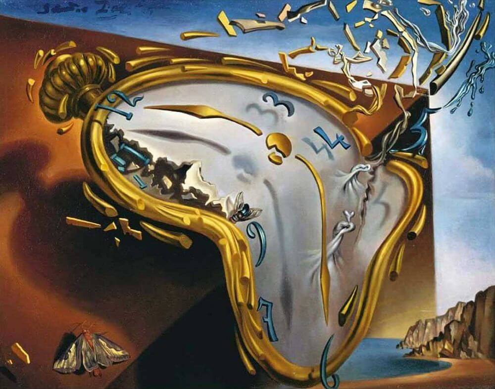
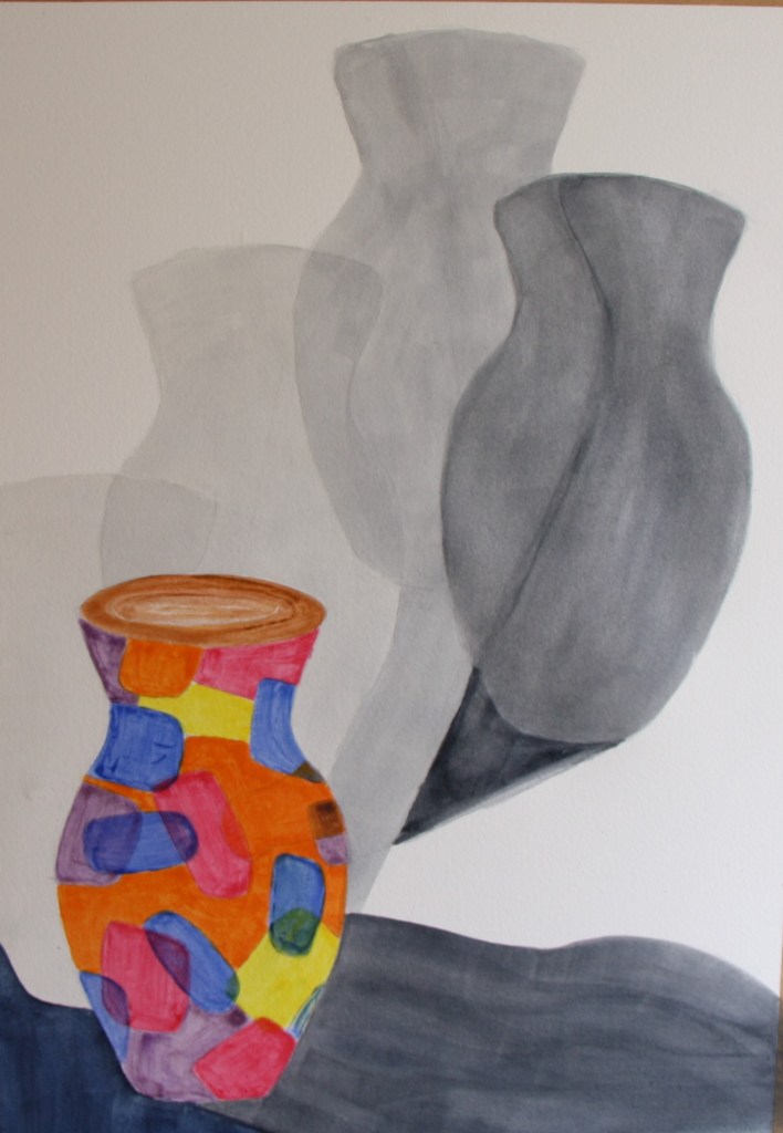
My next painting is an intention to paint my pot in a bent up state. I gues my inspiration for this is Dali’s melting clocks. An image of his work is below. Dali hasn’t outlined his watches so I might not outline my bent pot. I will see how this progresses.
I repeat my process of stretching my paper and begin to try to draw my bent shape. In order to give me a little help I bend a plastic container that I have in the studio which I store water in. A photo is below.

I remind myself that I don’t have to replicate my vases exactly but I do want to try that they resemble each other. I am after all reimagining the same pot. I eventually come up with a reasonable shaped bent pot and I begin to draw in where I think the pattern would be albeit bent. This is quite tricky and could be quite technical. However I’m happy that the placements are not going to be exact. Once I have the shapes in place I begin to mix up my tempera. Below is the drawing and trying to establish a reasonable shape.

Having settled on shape the next photo shows the painting beginning to evolve. I’ve kept to the same palette and have mixed my tempera with the gin etc. I like the jeweled effect that the tempera makes and this is easily achieved with the brush and you can twist the brush to suit your shape. I try to accentuate the line where the vase bends or creases and try to indicate that there are two blue shapes. I try to follow loosely where the shapes might be if the vase wasn’t bent. I keep building up my layers.


The above photo shows the glazing in most areas nearly complete. In order to give my vase some shape and form I build up the colour in some parts of the segments to be more dense. I have also given some shape to the rim. One thing I am learning is that if you make the tempera too thick it can fetch the underlayer off so although I have tried a thicker layer or too I do think its better to keep the glazes thin. I do want there to be some translucency so I mustn’t go too thick. Once I’ve completed the vase I consider the background. My previous vases have the table in the lower section. However my vase looks a little like it might not be able to stand upright. I decide to make the table high up in the picture plane. This may now give the impression that we are looking down on the vase. I also consider the black lines. I decide to include these as they appear on my vase in similar thickness but I decide not to use an outline of the vase. I also risk adding a shadow to the vase.

I reflect on my vase but believe that the background needs to be similar to my others and a shade lighter. Its more dense and more purple. I also decide to outline again in an attempt to ensure its similar to the others. This will also help it stand out.
Having outlined the pot it does seem a little better. I’ll now work on the colour of the space above the table.
The next image shows how I added a little more colour to the background with a rose madder glaze and I darkened and textured the grey area.
My fourth pot is going to be about shadows and how these emanate from the vase at different times of day. I plan to overlay each shadow, making them darker as the day wears on. My pot will be done in egg tempera and this time I will leave without the outlines to make sure I neaten up my work in the medium. My composition will be very different for my vase to have sufficient space for the shadows. In this regard my vase I place in the bottom left hand corner. For the shadows I decide to use just watercolour rather than the tempera as I think this will suit the work and the shadows better as the shadow doesn’t need to be translucent. The image below shows the jug drawn with the use of my tracing paper and template. The shadows are surrounding it and are intended to reflect as previously stated the shadows at different times of the day.
The image below shows how the glazes have built up on the vase and I think there is a ceramic feel to it and it has form. I deliberately don’t smooth the applications too much as I think the ceramic or glass like feel is achieved by leaving the brush marks. With each layer the vase is still translucent and like the others each painting has this lovely sheen. The base at the bottom need a little attention as its not quite straight at the bottom.

The image below shows the vase with the shadows. I gradated the washes of paynes grey colour and went deeper with each shadow. Although I don’t want the shadows to look too solid I do need to ensure that the colour is fairly even. I do like how the shadows are overlaping as I intended but I do need to neaten a little. I like how the last shadow is dark and turning towards the viewer. I do like the design of this one. time and place is so important in what I’ve learned. I was not sure what to do with the background but I really think that to leave it is best. The white works well and maintains a subtleness. I just need to ensure I manage to get the colour tones a little better on some elements of the shadows. The first two are fine but its where I’ve gone darker. I’ve also built up the colour on the rim of the vase giving it a darker rim which works well.
The image below is my final version with the shadows. I think I’ve managed to neaten up the latter shaded areas and it works reasonably well.
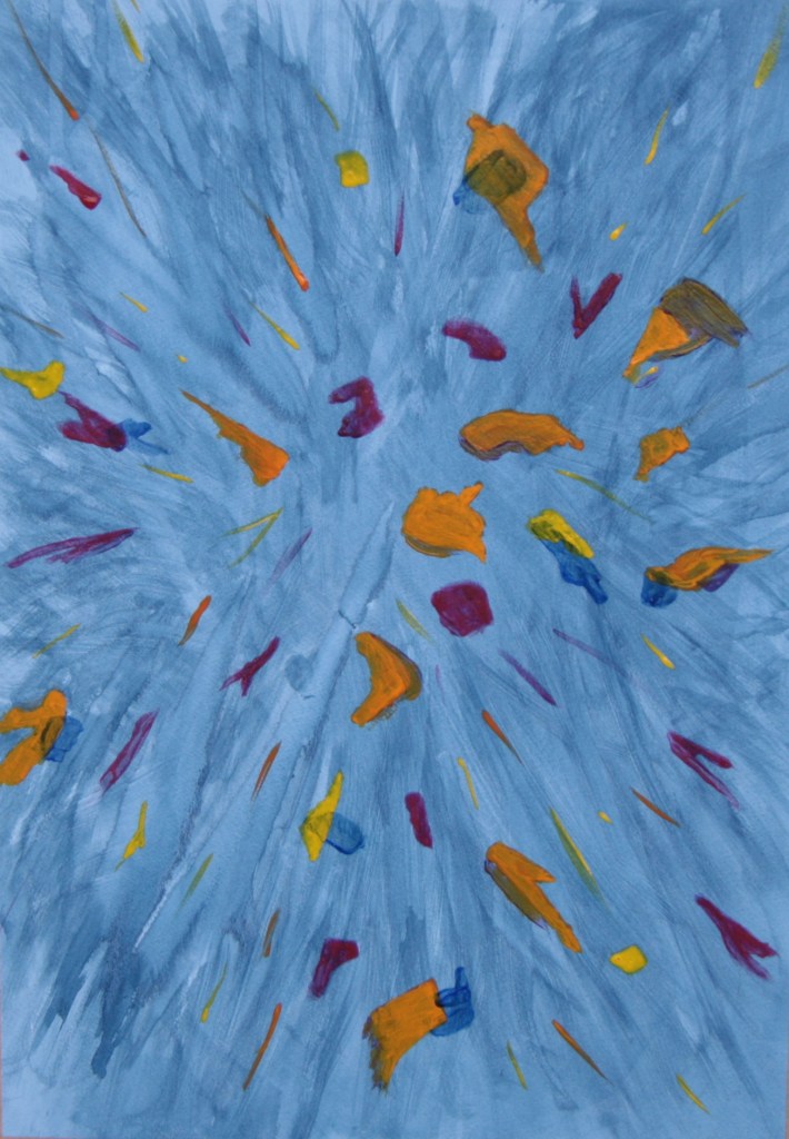
My final reimagined pot is titled shards. I began by considering how to convey a smashed pot. In order to try to replicate one of my pots I initially decided to cut up my template. However I decided it didn’t have to be such a complex work. I initially thought of replicating the pot like putting pieces together in a jigsaw. Having opted for the simpler idea of random shapes against a darker background. There are one or two images below.

As I began the work again on a large piece of watercolour paper, I didn’t initially tape it down in the traditional manner. This was my last pot and I was keen to get on with other things. I chose an indigo watercolour paint for the background and in order to reflect an explosion or shattering of the pot I wet the paper with a spray bottle containing just water and applied my mixed up indigo vigorously on my easel with a large 2inch flat brush. In places I let the paint bleed and once the paper was covered in the colour I used the flat edge of the brush back and forth sideways to create the movement. I thoroughly enjoyed doing this and as I kept going I built up layers and depth of colour. The photo below shows the background and random mixes of my egg tempera in the colours of the other vases. Although I need to coat up a little or try to use the tempera thickly as the background colour peers through, I do think it works reasonably well. I’ll be patient over the next two or three days and layer up. I will also for ease tape down my work to a board. The light in my studio isn’t that good today as my background looks grey in the photo.

Below are one or two close up photos of the painted shards. I’m trying to build up parts of the overlays in the colour too.
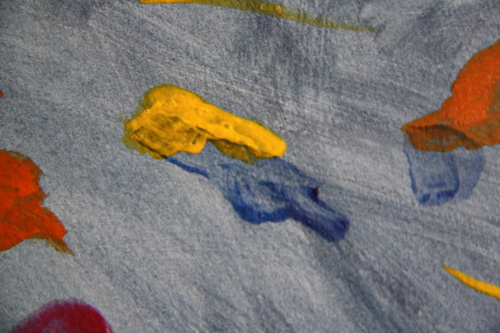
I do want some of the edges to be more jagged.
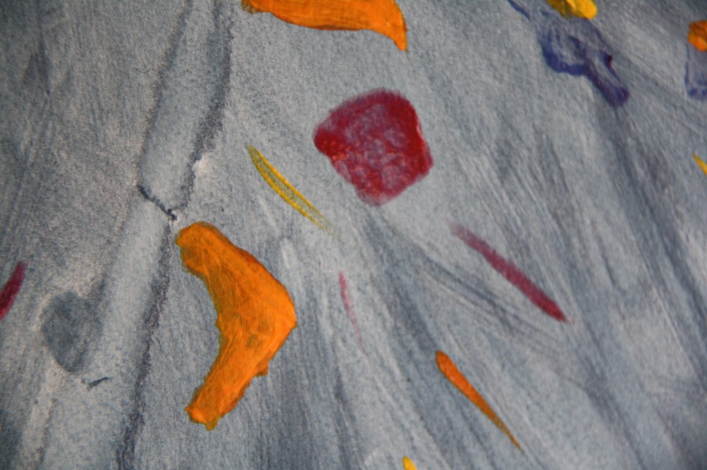
The final version of my work is below. I’ve built up more colour overlaying into the shards and in order that my photo did the work justice I too the photo outside. Thankfully my camera did capture the lovely blue background. On the right hand side I tried to depict a piece of the rim of the pot and this has worked reasonably well. I’ve also tried to capture the falling pieces on their side so you see a little of the inside edges of the pot. I think the overall effect works but some pieces could be a little better.
I’ve thoroughly enjoyed this exercise and I have not only learned a lot about pictorial space but it has helped generate ideas. I believe it has pushed me to really test out a new medium and I stuck to this to see what properties the egg tempera held and how I might use it in my work. I’ve used it on another exercise too and whilst it has such a lot of great properties for glazing and I love the sheen of it, at times when layering unless really dry it can take off the underlying layer so you do need to handle sensitively and carefully. I can’t say that I’ve mastered the medium by no means, and some of the drawing could be better. Using the template might not have helped. In regard to narrative I believe I am quite open and honest about my work. I try to narrate my progress and processes as I go along and I believe that I evaluate my successes or failures fairly well. I’m learning more and more with each exercise and I push myself to undertake challenging and experimental work.
