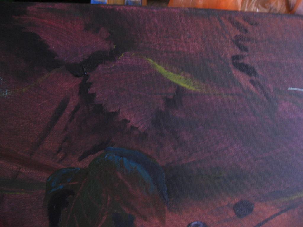
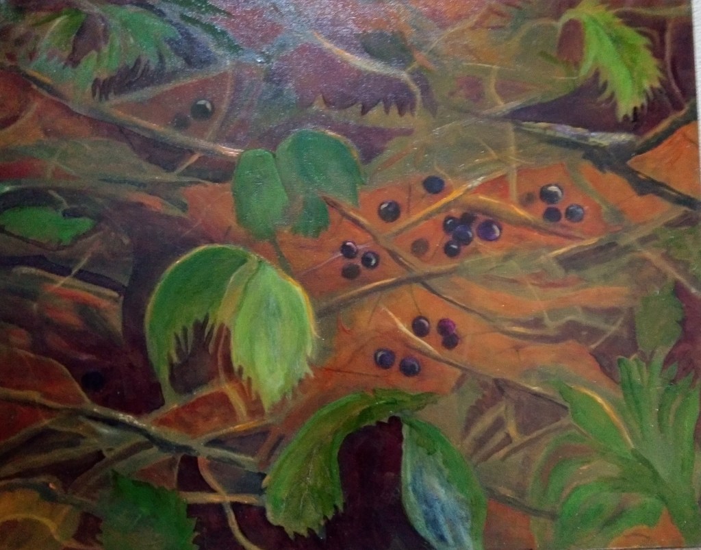
The following photo is where I left this painting in part 5.
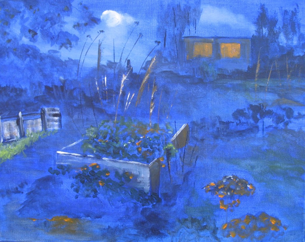
I needed to take into consideration the two light sources that are present. The first is the light from the moon and the second is the light from the windows in the shed. Both reflect different shades so I just hope I get the desired effect. I add in some light tones on the foliage from the light emitted from the windows. I also add a little more colour to the windows. The light here as it falls on the foliage should be a more brownish orange. I add this in under the window and I’m careful not to just block in heavily. It needs to be subdued and subtle. I also add to the middle ground some green but again subdued. I highlight this with a white tinge as this light is from the moon. Drawing and painting is all about the light. The light and darker shades of colour in shadows and the light will be different depending on the light source. In Painting 2 I learned a lot from studying Hopper and Joseph Albers. I am trying to apply the knowledge I’ve learned and to hopefully demonstrate this in my use of the colour palette. I think the light works but I feel I need to add just a touch more definition to my shed and to tone down the windows a little. The tones in the foreground work well with the light falling on the tips.
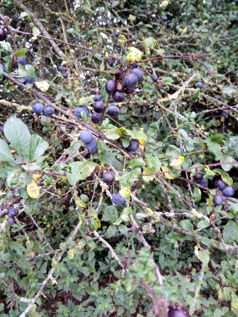
In this next painting I’m using oils again and this is a scene of the black berries in the undergrowth. My photo of the image taken on my foraging map journey is below. This is what the map and nature has given me. Beautiful rawness.
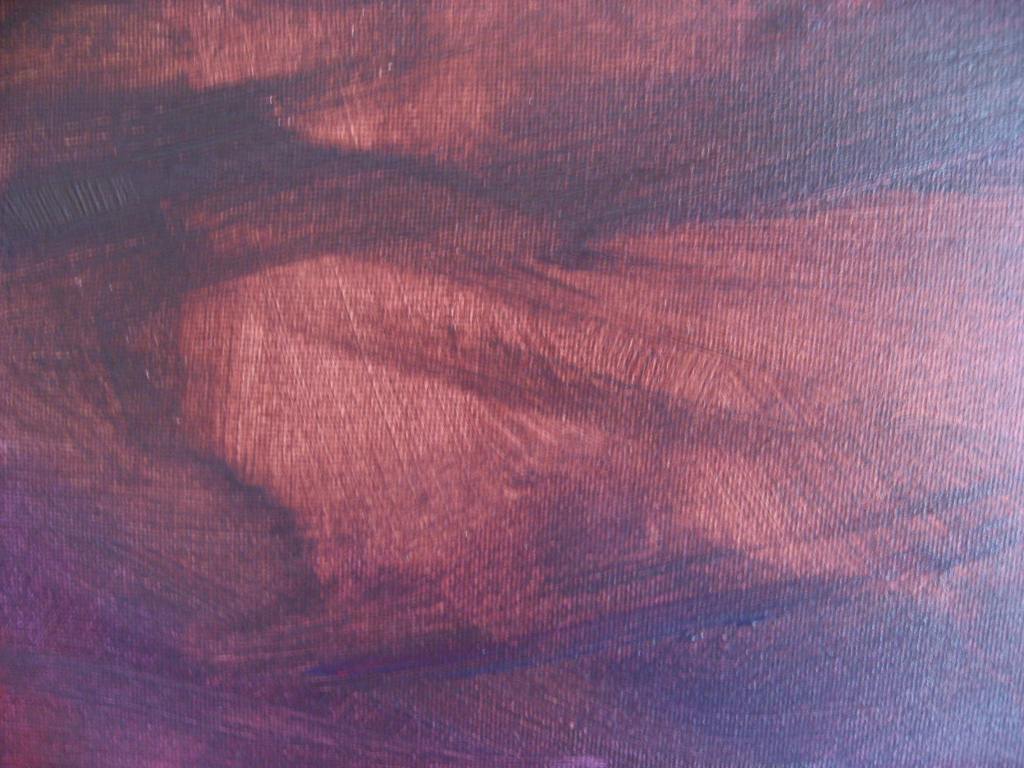
My version is very different. It is more of a representation of the fruits, the ruggedness of nature, its beauty but very importantly its about the light. I began by toning the canvas in a wash of alizarin crimson and a dash of ultramarine. I wanted the washes to be fairly thin but to cover the canvas. In parts the wash is mote dense deliberately and I aimed for the light and white of the canvas to show through. An image of an area of the toned canvas is below. I would place the berries on the lighter parts of the canvas. I want to depict the undergrowth with light falling on the berries and the twisted branches gnarled and intertwined. Further and in contrast to my photo I intend to have one or two larger leaves in the foreground.
I begin to position one or two leaves and start to paint in my berries. As my canvas is quite dark I need to ensure I find the appropriate leaf colours that compliment the earthy ruggedness of nature and my existing palette. I want the greens to lighten some of the picture plane. The image below shows how I’m trying to sculpt out the leaf shapes and how I’ve painted in some fruits and a bluish dark leaf. This is a painting that I anticipate building up layers of different colours as the old masters did to capture the light. Capturing light is all about the illusionary qualities.
I keep working the painting testing out the leaf colours wiping paint on and off but also allowing the underpainting to show through. I painted in lots of the branches like runners and I will need more of these. Myfruits are painted strategically in the lighter areas of the canvas. I mix up a deep purple from alizarin crimson, ultramarine and a little paynes grey. I also touch them lightly with a tinge of white to create more form and to serve as their bloom in the light. I use more of a drastic measure to add in the light and this does work. I run a thin brush of orange (deep cadmium yellow), against the dark branches. I reflect on how the painting is developing and I decide to leave it there for today.
I continue building the right colours to my leaves. Colours that are tonally harmonious and earthy.
I continue with the addition and subtraction of my paint very similarly to the techniques I use with the charcoal. Adding paint and wiping it off to leave the trace. What I’m beginning to see is the streams of light showing through and I must not lose this. There are sufficient large leaves. The fruits are coming on nicely. I like the bloom and they do stand out on the background where the light shows through. I am feeling so much more confident in my painting with every stroke. I was worried that what I’d learned through the charcoal wouldn’t transfer to the paintings. I get lost totally emersed in the work and this embodiment of experience is fully taking my work to another level of artistry if that’s the right word.
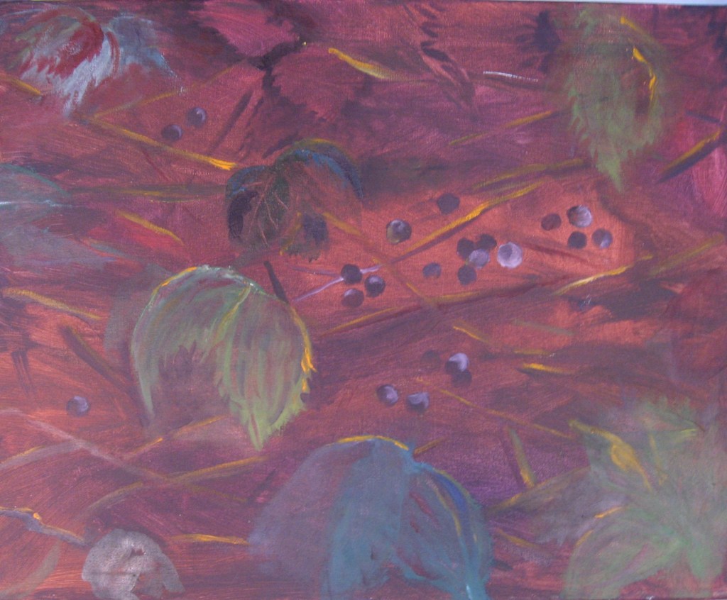
Another day of layering with the orange tones today and the colours are really beginning to show through for me. I shall leave here today and then probably return to the fruits and concentrate on the detail. The detail will include finer tendrils. Todays work is below. Some areas really looking good and the light shows through really well. It pays to persevere.
I continue another day on this painting below. This painting is becoming a really fascinating labour of love. I add in some smaller leaves, just a couple. I find I’m pulling and pushing the darks and lights and recession. I add into the larger leaves some decay and I also make them a little more green. My fruit I overlay with a little more blue. This brings some fruit forward almost as if they are in mid air. I add in more bracken and they do look as though they are intertwining. I leave there again for today but reming myself it is abstract.
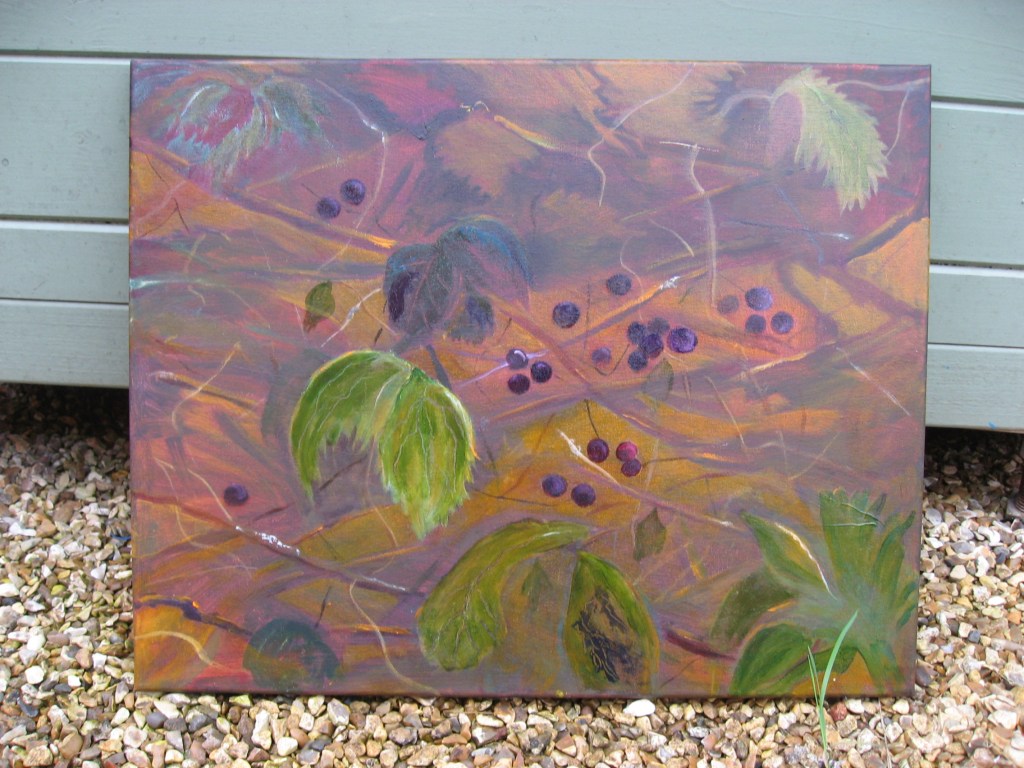
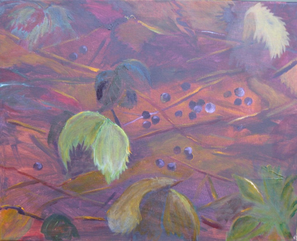
Another day with the blueberries and I take a little drastic action. I wash over the whole area with a mix of yellow ochre. I’m doing this to unify all the areas as some look a little dull. I work this again and the yellow has worked but I rework more colour into the painting with more glazing. I have trouble with photos as the light picks up on some areas of the painting and makes it have a sheen. My tutor advises me to look at the OCA website. I take a photo from above and try to ensure the light is even around the picture. The photo is definitely better but I will try surrounding it with white boards. There are some lovely rich earthy colours developing. Sadly there’s still light at the top of the picture. I’m almost done on the painting.
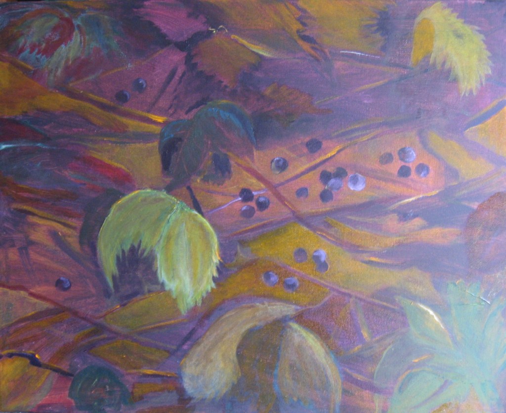
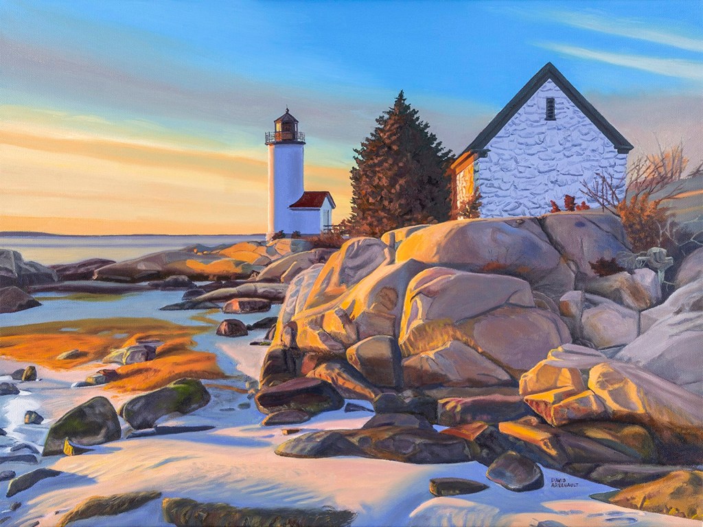
I surround the canvas with white boards to get an even balance of light. Although this photo is much better it still doesn’t do justice to the work. The glazing works well and I could build on this more if time permits. What is brilliant is how the skills learned around subtraction or erasure and also now included in my painting and the subtraction and layering through glazing is working better for me. The colours are rich. In this painting I’ve also used the deep orange touches of David Arsenaut’s work below on some of the branches to show where the light falls and this really works well.
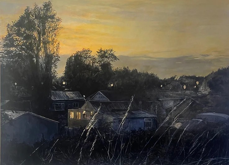
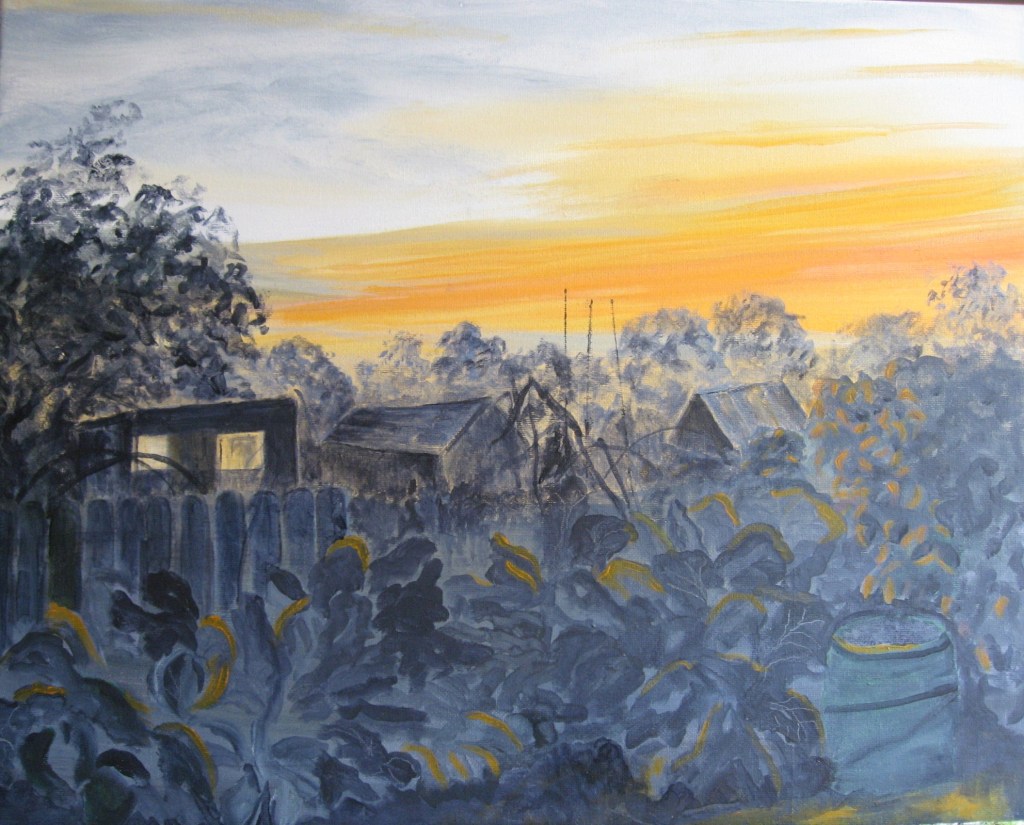
My next scene is another painting in oils but again of the allotment in the evening. We are lucky to get lovely sunsets here so I want to capture this. I want to utilise the light from the sunset as it rests in the windows of a shed and as it kisses the trees and folliage.
Prior to setting to work on the painting I do a quick charcoal sketch to create a different perspective. I want more sky for the sunset. I still apply the rule of thirds to my composition but doing the quick sketch helps me to consider the tonal values too.
My palette is mainly paynes grey and orange. I shall vary these in mixes to provide the different tonal qualities, shape and form. I may also utilise a little green. I deliberately don’t for this painting tone the canvas all in one colour as most of the lower part of my picture is darker greys. I’m working with water based oils with additives of safflower oil and zest it. I use a range of flats and filberts in varying sizes and a small round for details. For the sky I used a large 2inch decorators soft brush. This helps with blending colours.
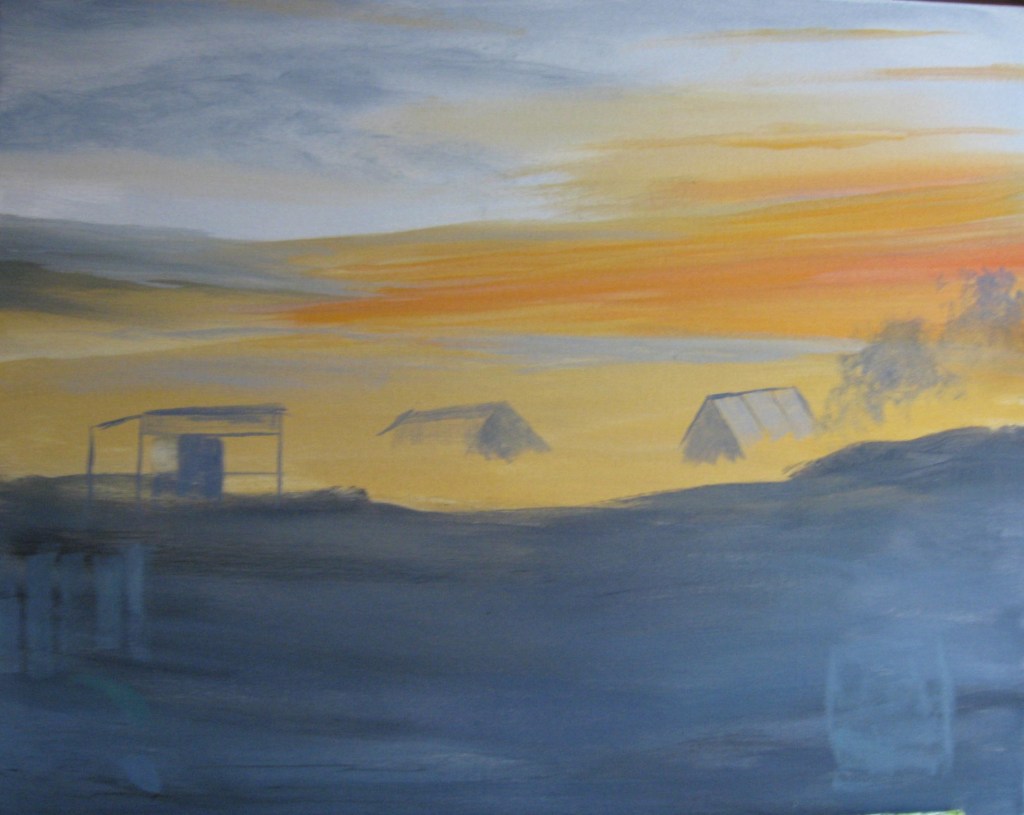
My first image showing the sky and covered canvas is below. I’m probably breaking the rule of thirds a little as I want to ensure I include plenty sky. My composition as a whole may also be slightly different but I want to capture the effect of the light.
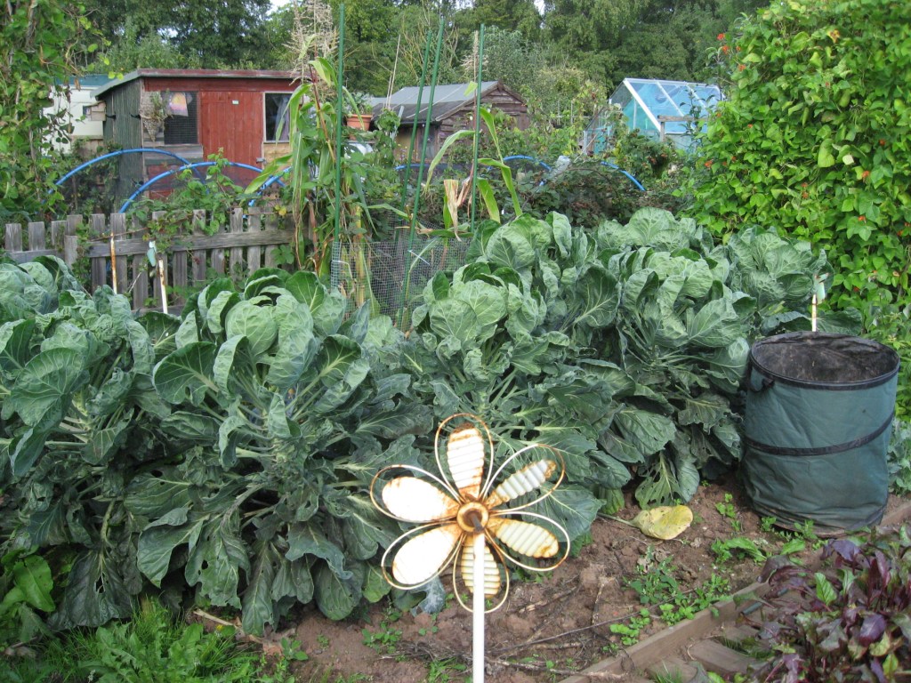
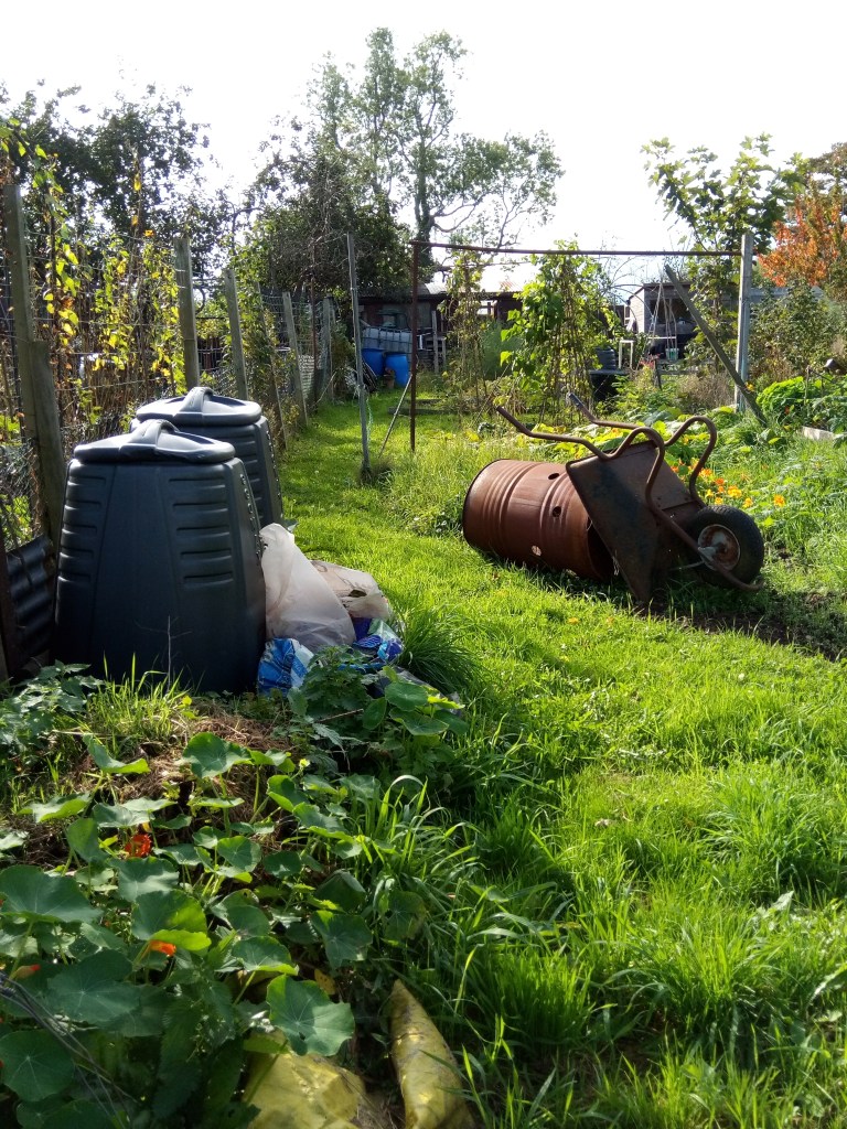
The reference photo is below.
My first image of the canvas is also below and I have completed the sky and the bottom range and the main elements of the composition. I quite like the sky, its feathery feel, and the building are roughly in the right place although a little more spaced out. I test putting in a little fence and the huge container for the garden waste testing out a little placing and colour. I leave it there for today to dry. I could have painted the whole canvas in the oranges of the sky but I shall only use the sky colour in the bottom of the painting and want it to look overlaid. In part 5 Parallel Project I mentioned the work of Judith Tucker and I loved her palette of greys and yellows in the sky. One of her images is below. I am trying to replicate this palette in the sky in my scene but I’m also trying to go a step further with the orange sky colours reflected in the foliage. This orange was more based on another image from an artist featured on Artnet. I down loaded the image but sadly didn’t keep the link.
Judith Tucker’s image is below.
The artist that produced this work is David Arsenault. I just loved the daring vivid oranges reflected from the sky onto the rocks. I will put some orange into my painting but not quite so vivid as my sky will be darker.
Another day. I work on the painting some more starting to define the buildings a little more and to work on the foliage. I work on the background foliage and the trees first, trying to work my way down the canvas. I also begin to consider the foreground and the texture of the runner beans growing at the right hand side. I also put in some of the fence. This will be covered up on the right by the foliage as I build this up too. I test out one or two shades of green but I may revert to full tonal grey. I leave it there for today. I’m really going to try to capitalise on that sunset and let its light do some work.
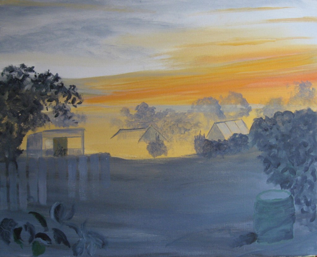
I work a little today on most areas. I firstly work on the foliage in the background. I decide to make my buildings a little bigger and more towards the real spatial difference between the two on the left. As I work more on the foliage also on the beans I decide to put in some orange to their leaves to test out the light falling on them from the right. I make a tone suitable, more of an orange brown.
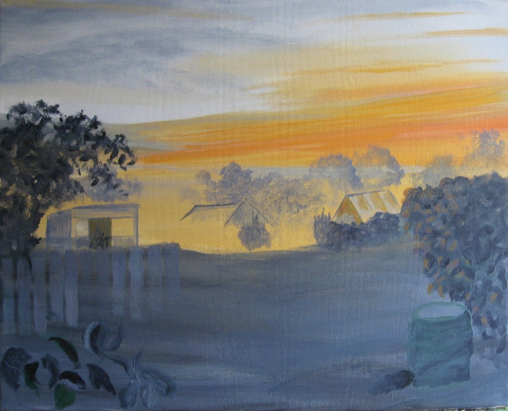
Reasonably happy with the foliage on the right I work on the fence the rear foliage by the fence and the cabbages in the foreground.
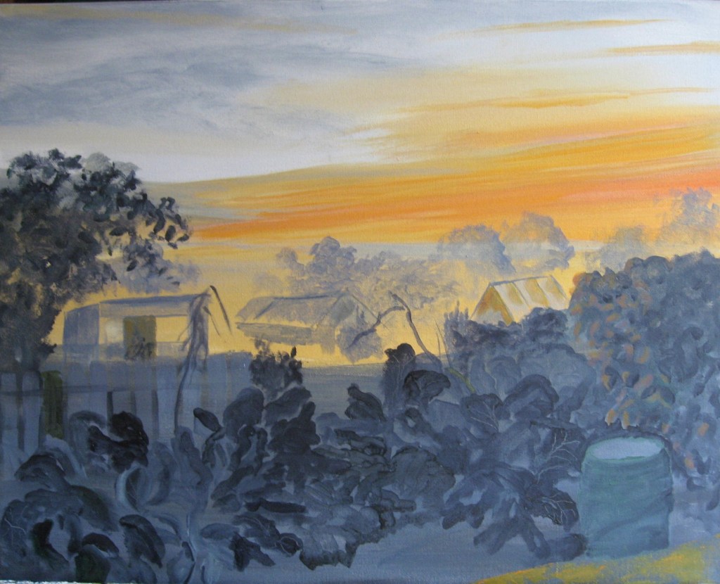
I quite like the cabbages and in one or two I’ve added in some line and definition by scratching in. It’s really important now that I don’t mess this up. I am going to add in light from the sky but I need to ensure or my detailed areas are sound. I leave for today and will work on this some more tomorrow. It’s important to get all the areas tonally sound and compatible.
I do decide that the orange tones will work and today I paint more to test out further. I’m mindful of where such light will fall so I look at the edges of the foliage and I must not overdo the tones. They will need a bit more of a tinge but I’m happy with this and to follow it through. I now need to finish the details and ensure the background tones are harmonious too.
Another day with the painting. I work on the mid area, the sheds and distant trees. Also add more to the foreground.
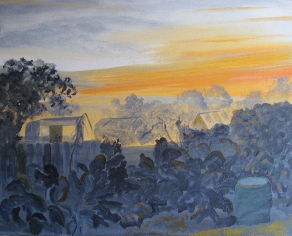
Another day and I worked in a little more of the details. I think almost finished now. It was a huge risk going with sunlight on the cabbage leaves and the beans but the photo doesn’t do the colours justice.
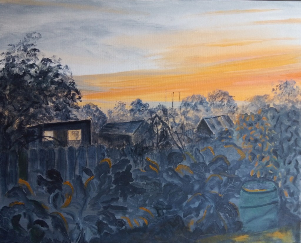
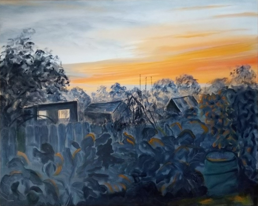
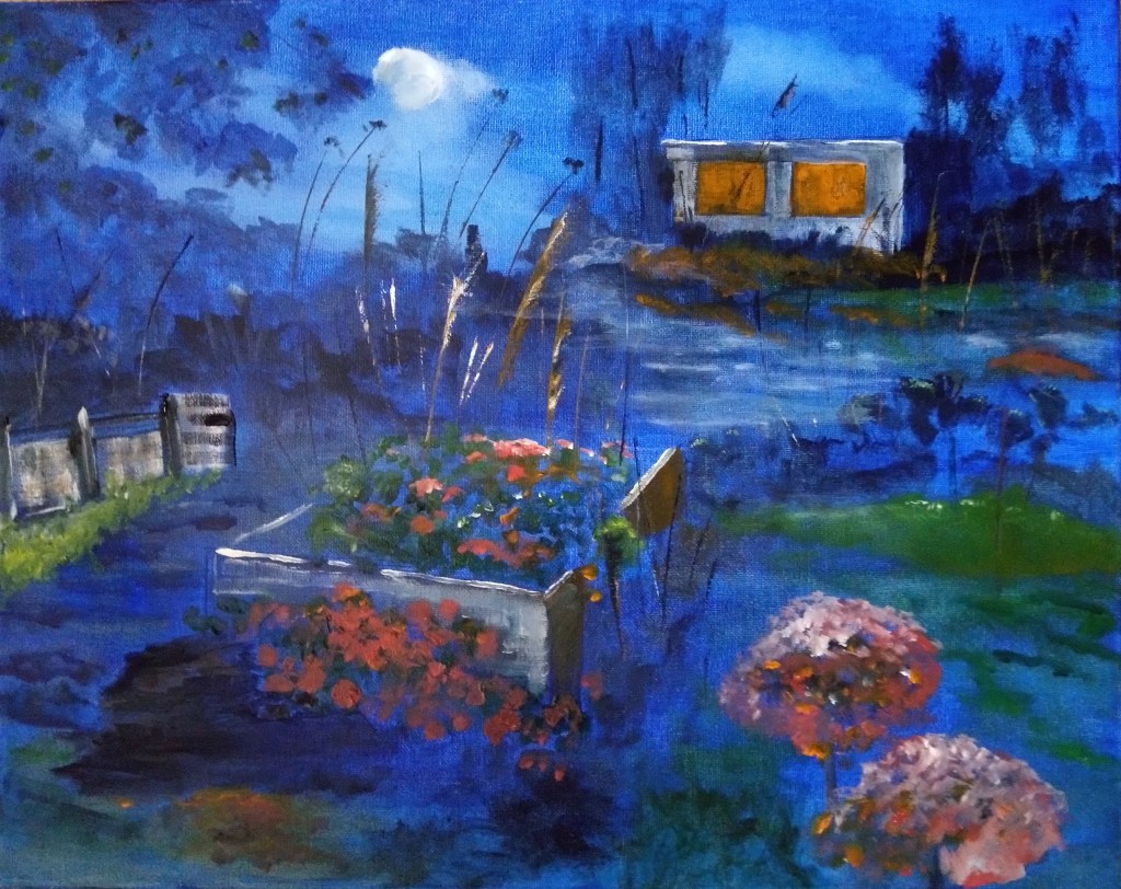
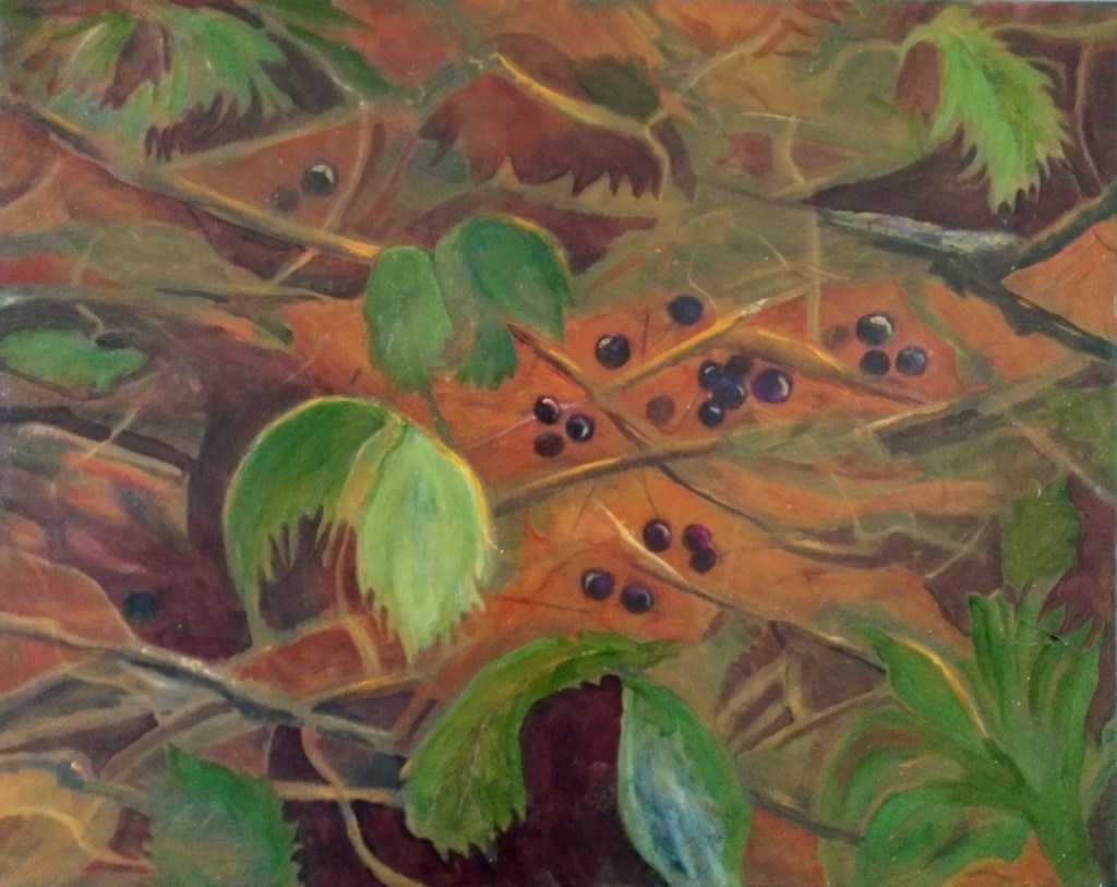
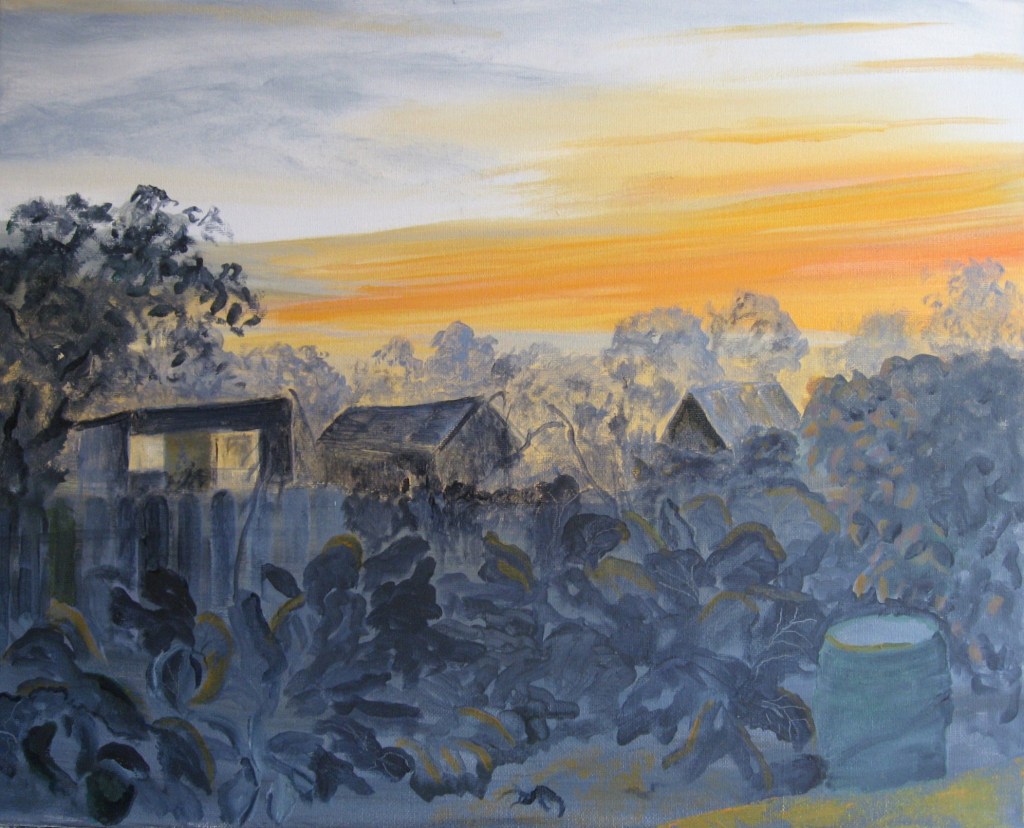
I tidied up one or two edges and I’m happier with this photo. However it still looks better on the easel. I’m leaving it there otherwise I feel I could ruin it. I add in a further photo as I’m also trying to improve my photography skills as guided by the OCA. This bottom image was taken with better balanced light and it is more accurate in terms of colour and depth.
I still couldn’t leave the charcoal alone. The photo of the image is below as is the drawing. Its beginning to take shape now but still more detail and tonal work but I feel confident it will work well.
Again I altered the composition so that the paper size is the same as my other drawings for the exhibition. The main focus here is the bins and the wheelbarrow and drum. I may still darken a little in places and the shadow under the drum needs to be softened.
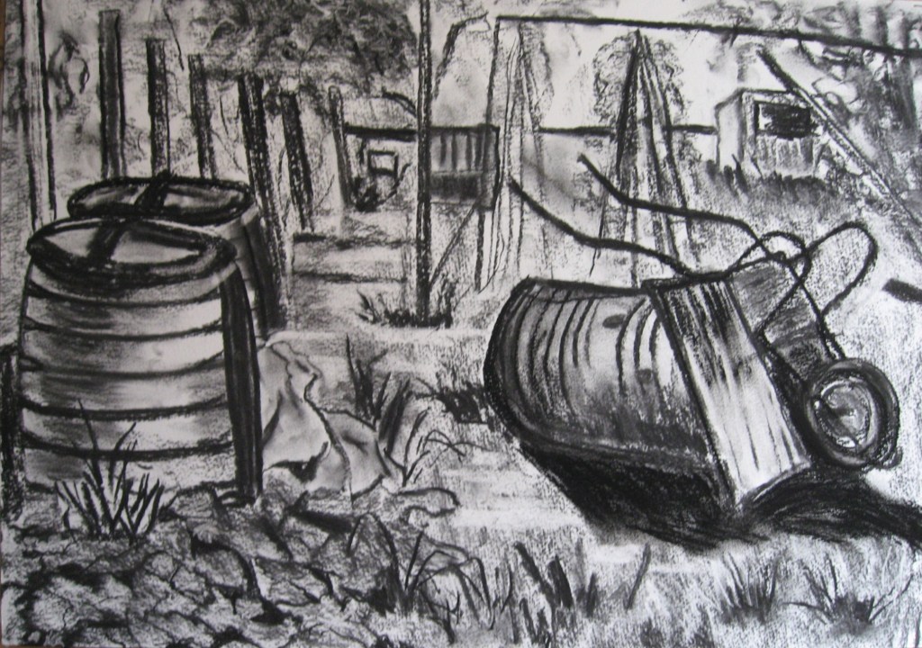
I work a little more on this to give it a little more body in places. I work on the shed darkening the side, I work a little more into the trees and wigwam. I also work a little more on the shadow and the drum, also defining the bags a little more. The final photo is below.

