- Research the artist Lin Chuan-chu in Drawing-The Purpose (available in the
UCA online library). Think about how personal, cultural and social histories
have influenced his work.
- Select an historical event or a period of time that is significant for you and
make a series of small drawings that represent or communicate certain
I researched Lin Chuan-chu and read the suggested article.
Lin Chuan-chu was born in Taiwan in 1963, and graduated from the Fine Art Faculty (Chinese painting major) of the Chinese Cultural University Taipei in 1990. He completed a graduate certificate in Art History at the Fine Arts Academy of China in Beijing in 1991, and from 2000– 2003 was a visiting artist in the School of Art Institute of Chicago. He graduated from the MFA in Interdisciplinary Arts at Goddard College, Vermont, USA in 2003. He now lives and works in Taipei, focusing on autographical themes to do with his upbringing in a farming family. He is a highly regarded contemporary ink painter and installation artist in Taiwan and has recently (2006) completed a residency at Red Gate in Beijing.
Drawing : The Purpose, edited by Leo Duff, and Phil Sawdon, Intellect Books Ltd, 2008. ProQuest Ebook Central, http://ebookcentral.proquest.com/lib/ucreative-ebooks/detail.action?docID=415349.
Created from ucreative-ebooks on 2023-02-13 16:27:46.
I took the above details from the book and the artist has clearly through his work and artistic education received international acclaim.
As I began to investigate the artist there were some similar traits in the artists processes and thoughts on drawing to those of Kentridge and now similarly to myself. I am understanding more fully how I am thinking when engaging in the drawing process. Similarly to Kentridge this artist has a range of talents in his repertoire of work. He works with drawing, painting, performance and video and he can work on these simultaneously. His work is based around his life and cultural history and in this regard it can be quite diverse. What he says however about the drawing/painting process really resonates. He mentions how unintentionally he creates work that relates to history or his culture without any planning. He refers to the silent conversation of drawing and the achievement of the work through ‘gaze’. Kentridge explained this process a little differently referring to endless possibilities. With both of these artists there seems to be a deeply immersive process and engagement with the materials and the outcomes seem to just materialise without too much consciousness.
Lin Chuan-chu’s work is quite exquisite and seems to have innocent childlike qualities. His work is underpinned and relates to his upbringing and cultural experiences. He refers in the questions and answers of the book that in 2000 he went through a difficult time as he and his family had moved to Chicago. He found he was unable to paint the beautiful landscapes he completed in the past. This sounded like he was almost paralysed or stuck. It reminds me of the fact that it is difficult to sing if we don’t feel emotionally good. So much can affect what work we produce. I include below some examples of his work.
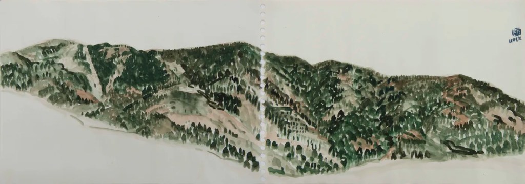
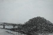
The work below is called mountains and it looks as though he’s covered two pages in his sketch book. I love how he’s captured the undulating hills.
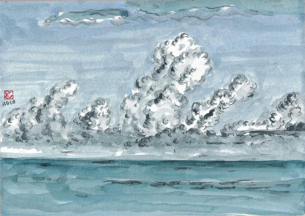
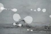
This work below is titled cloud -sky and was completed in 2019. It reminds me a little of Van Gogh’s work and the brush strokes in his clouds.
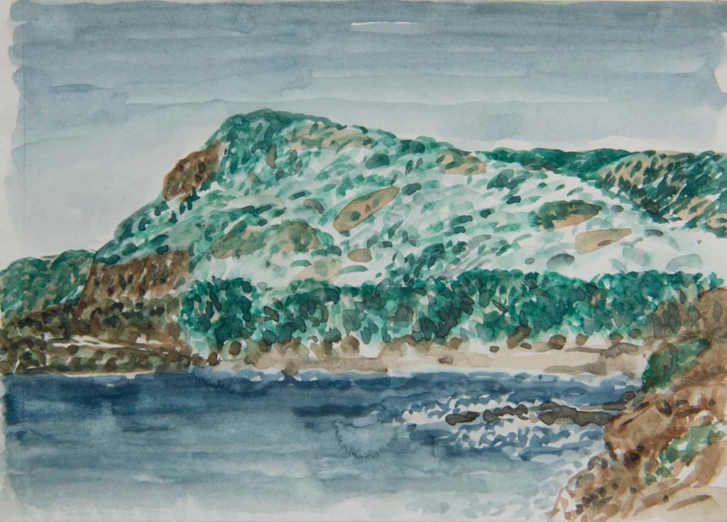
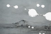
This one above is called zixu and was completed in 2018. I really like the use of these colours and how he builds shape and form through the overlay of the dotted marks.
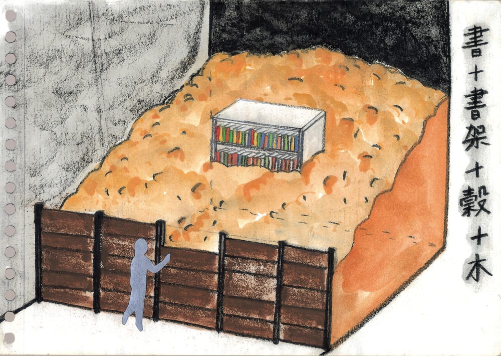
The next one below is called barn and refers to the farming life of his family. Interestingly he seems to have a bookcase with books in the centre. I think the painting is quite revealing of the grey outsider trying to look in.
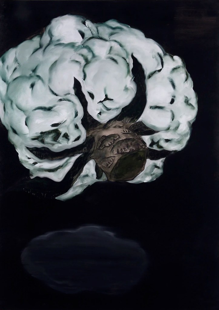
In the chapter on his work we see sketches of seeds and other images related to farming. The image above is called simply cauliflower ii and was painted in 2009. It has figure painted into the stem.
The artists life, upbringing, culture and the experiences he’s been exposed to have all had a bearing on the work he’s produced. Sometimes the work can be quite a therapeutic and healing process. We don’t have to go far to consider and find important or meaningful subject matter.
Anne Marie Creamer and Qui Anxiong
We were also asked to consider the above artists.
Anne Marie Creamer’s drawn version of Meeting the Pied Piper in Brasov, a
paper prologue (this precedes a video piece). In this piece she plays out a
narrative through a series of ink drawings on pages that she turns over
one at a time by hand. Search for the video on Vimeo.
● Qiu Anxiong’s ink drawn animations feature different approaches to the
representation of movement and the passage of time. Search online for
his animations In the Sky (2005) and Temptation of the Land (2009).
I loved the way Creamer presented the work. Each drawing was in dark almost monotonal colours which gave the sense of time gone by. As each page was turned by hand you had sufficient time to really gaze upon each drawing as the story unfolded. As I looked at this as a process I couldn’t help but compare these black and white images to those used by Kentridge. Sometimes his animations are quite quickly framed and it is easy to miss an important fragment. I have found myself going back over his animations to make more sense of them. With this approach there is more time to digest the story as it unfolds. Her website is below. I would certainly like to try this technique. I have checked out my camera and I do have ten minutes of video space so I shall try doing a short demonstration.
http://amcreamer.net/meeting-the-pied-piper-in-brasov-a-paper-prologue/
Qiu Anxiong
I first found a video of how the artist has created some animations based arounf chinese culture but with a more modern twist. He creates mythical creatures in his landscape and seascapes. I found drawings of In the sky on the met museum website as below.
https://www.metmuseum.org/art/collection/search/77560
I really love the drawings that he makes quite surreal with some of his inclusions. The latter drawings seem balloon like. Controversial maybe? I liked his animations but I couldn’t capture the drawings as the site wouldn’t allow me access.
The exercise
These drawings take me back to childhood and the things I enjoyed as a child. I propose to draw activities of skipping, hopscotch, a ride on a scooter and kicking a ball. I’m learning more and more that not every drawing will be good in regard to the anatomically correct and my aim is to make more gestural figures. My aim now is to enjoy and be relaxed with my process. Getting lost and submerged in this new found drawing medium of charcoal and the immediacy of it, encourages me to do more.
My first drawing I took from an image on the internet. I drew quickly the lines shapes. Some lines I blur and others then resharpen. My mechanical eraser is at work again as is my dust free eraser. My image is of a small child aged around five. She has pigtails. I will try to draw the same child in each activity.
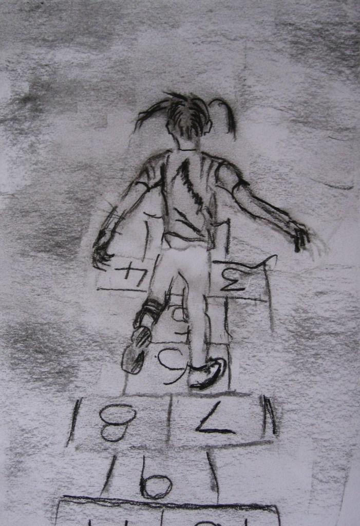
The first image is below. I’m completing the drawings quickly using broken line. I draw and sometimes re-draw just to get the main shapes and some energy into the drawing. The hands are a bit peculiar and I could have done the hopscotch drawing a little longer as no 1 is missing!
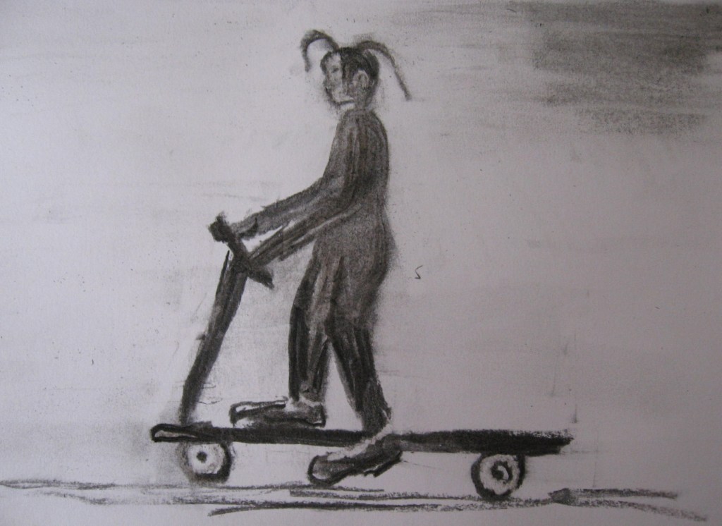
My next drawing is a child on a scooter. This time I change the style a little working more charcoal into the figure. Both of these styles work reasonably well for me and if I work more charcoal I use the eraser to forge my lines. Again I work quickly as the charcoal is messy. My drawing is below. I make gestural marks on the face and as I take the photo I realise she looks bald. I’ve left the solid colour so she has overalls on or dungarees.
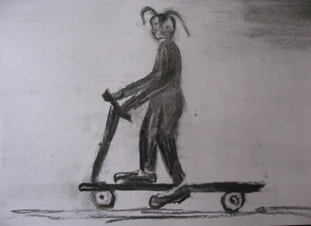
I adjust the drawing a little to give her some hair.
My next drawing is a child skipping.
I’m drawing the three children with a child at each end holding the rope.
The more drawing I do the more I’m understanding about how I’m drawing. I’m almost developing two styles. From the thick bolder blocks of figure shapes to the finer more broken line. In some drawings I’m using both. I sometimes start with the willow sticks block in a little and then rub out and go for finer line. I quite like both styles so whatever gets to look better as I work through the processes of shapes and then detail is okay.
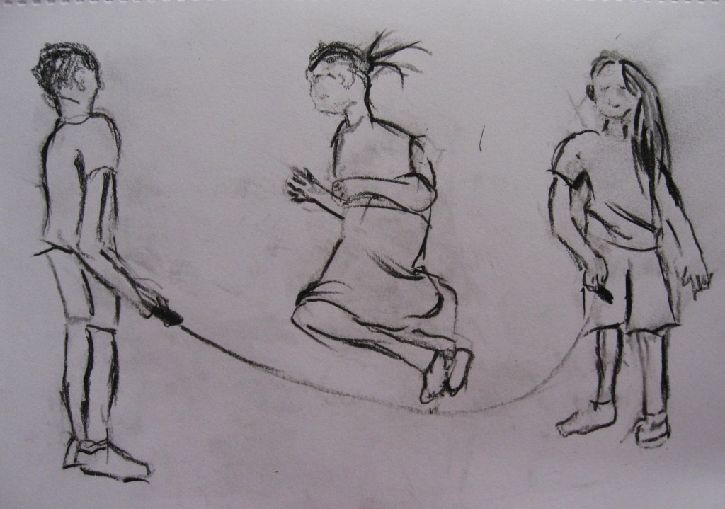
The skipping drawing is above.
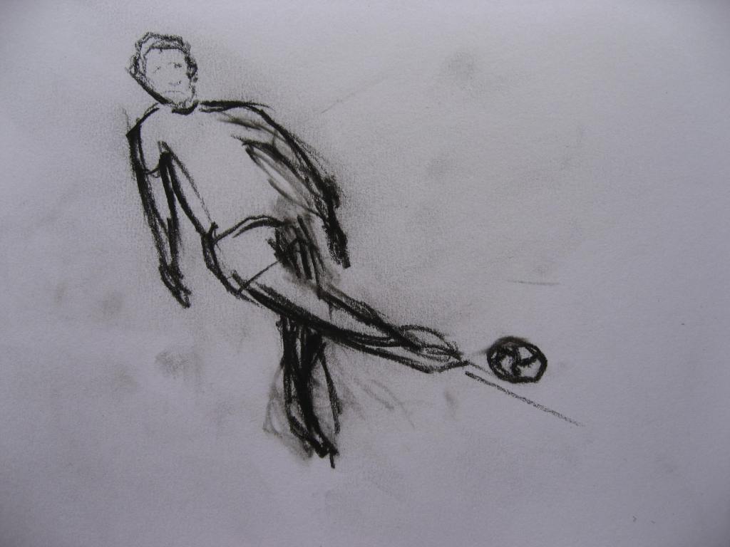
The next is the footballer. I struggled a little with this to get the legs right. I’m trying to get a lot of movement and speed into the body. I fleetingly glanced at an image on the internet and then tried to memorise the shapes in the studio. As I kept altering and going from dark thick line to softer I found myself darkening a lot of line in the rear leg as I wasn’t sure where it should be placed. The more I looked I decided to leave it as I think it adds to the drama and the movement. Sometimes the erasure marks become as important as the line.
I’m not so sure the drawings give a sense of the past as some of the activities are prevalent today. For example children skip and play football and even the scooter has had a revival. I guess I could have dressed them in sixties clothes, longer shorts and baggy t-shirts. For me this exercise has mainly been about creating reasonable figures. It’s still a bit trial and error but my figures don’t look so wooden now. The majority do seem to have some life in them.
I haven’t displayed them as I don’t want to take them out of my sketchbook. I hope this is okay.
