PART A
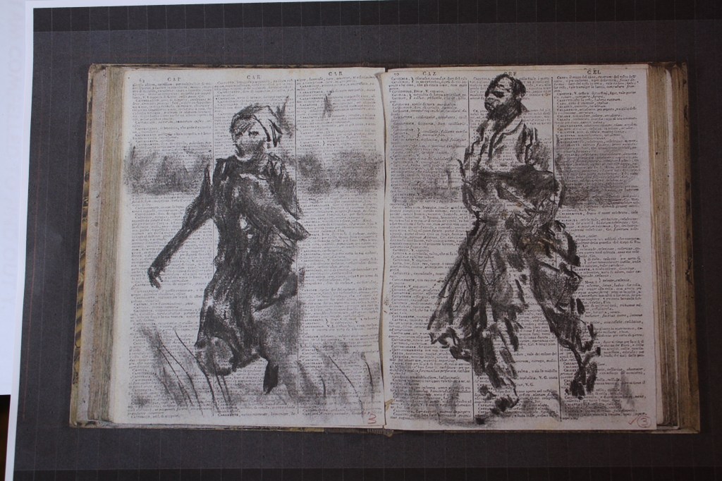
This assignment is really fitting in now with my ongoing parallel project. I have really found what I have learned about mapping very thought provoking particularly around the issues of who and why the maps are created and with what agenda. I am really trying now to improve my drawing skills and the use of charcoal really seems to work for me. I just love its properties and the rubbing in and out process that eventually reveals a reasonable drawing. For Painting 2 and now in the Parallel Project for this course I have been already using a foraging map created by my local transition town. The images and the work I’m undertaking is inspired by Kentridge. I am going to see his exhibition at the RA on 8th December. I include one of the drawings that relates to this assignment below. I love how the artist has captured such fabulous movement in the figures. The use of the book text as his support is such an inventive, and imaginative idea. Each stroke we see is very gestural but the image is very powerful and striking. Kentridge also makes use of maps in his work too.
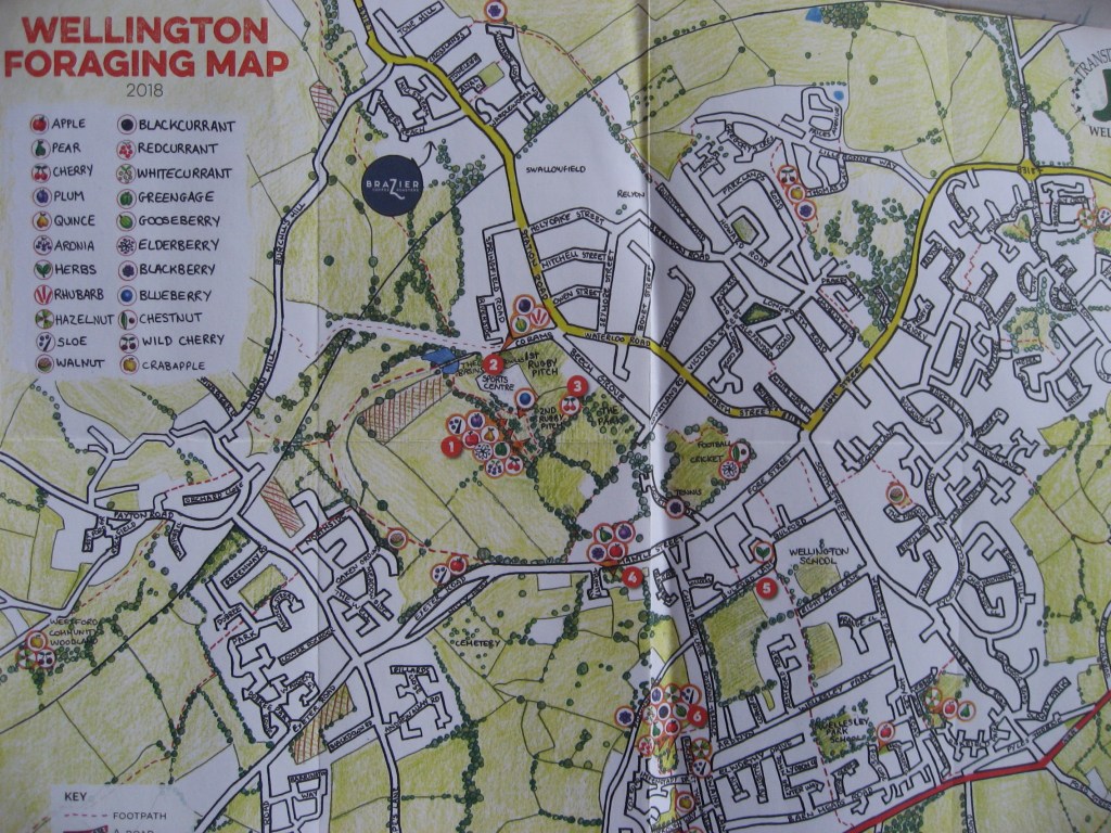
As we are to use maps for the assignment I decided upon my foraging map. A copy of one side of the map is below. As my map relates to a whole area and includes the transition community being involved in planting trees and fruits, conservation and preserving the wildlife my images will be set upon the maps of the figures undertaking the planting or toiling the soil.
There were various ideas in my mind but I don’t want to be too ambitious. I do feel I’m beginning to make good progress and don’t want to spoil things. I decide upon ripping up my map having photocopied it several times. I use an A2 watercolour paper to work on. I did consider a mountboard but will stick to the paper as this may be easier to write text on. My aim is to produce a broken jigsaw-like map as my background and to draw the figures in charcoal. The ripping of the map will symbolise the digging and ripping into the soil as the earth is moved and the planting takes place. I just hope I can do justice to the figurative drawings. I place my paper onto a board and begin by tearing up the maps. Cutting is too sharp and clean. Tearing gives a more serrated feel.
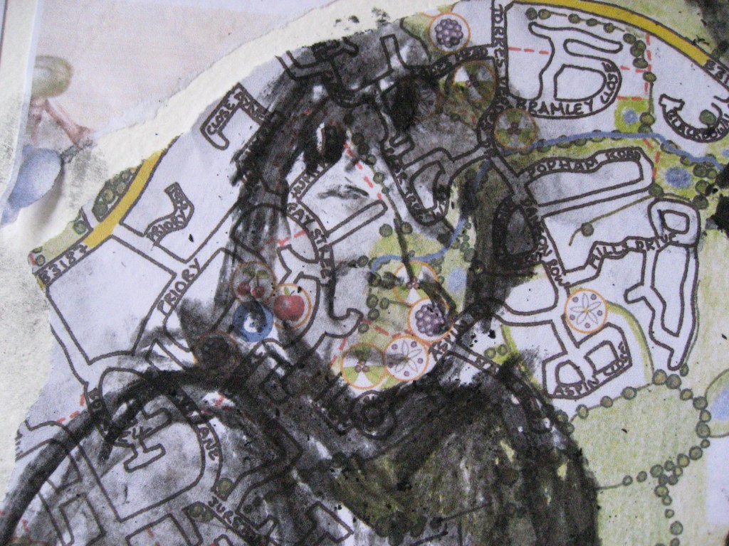
The map whole is A3 in size and it has recently been updated and I found new copies in the local bookshop. I rip a few pieces and decide that I need to place them not just randomly but so that the corners or edges fit the edge of my paper and that the gaps in between the torn pieces are not huge but also shapely. I also try to cover the whole area with full pages of the map but adding pieces on top didn’t look right. The ripped pieces and some whole map pieces are below.
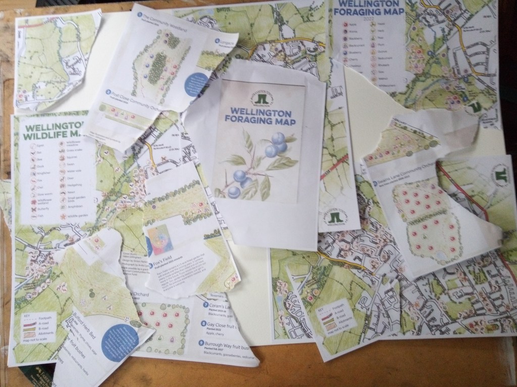
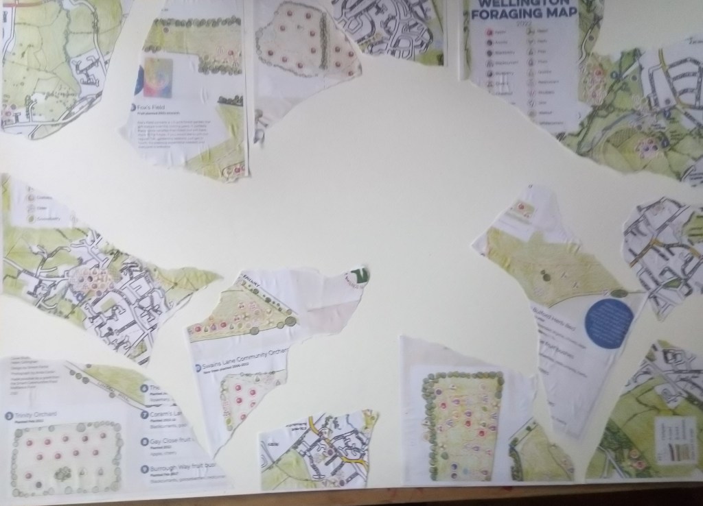
The photo below shows the map as I start to get it ready to draw my figures. As it pieces together I don’t want too many huge gaps in between the pieces so as I tear them I roughly tear them to the size of the gap I want to fill.
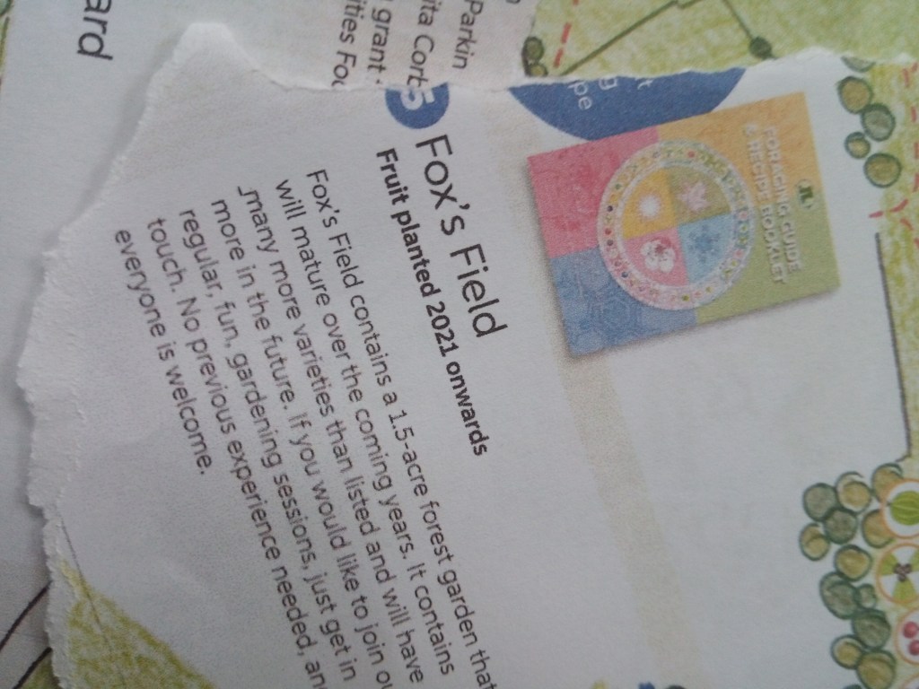
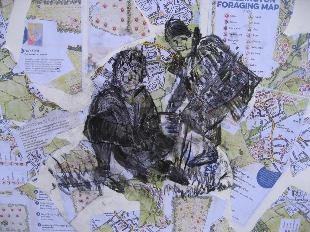
Below is a close up of part of the map which contains details about the Fox’s field. This is a newly acquired piece of land that the Transition team have planted up.
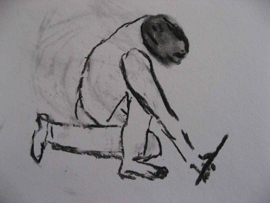
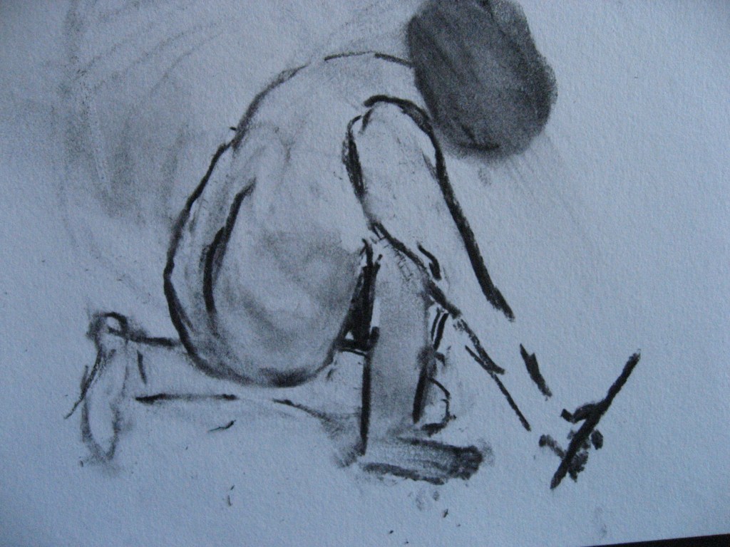
Once the mapped area is covered reasonably well I begin my drawing. It’s based on a picture on the map of a couple planting a tree. I include the photo of them as I begin to draw in the male figure in charcoal
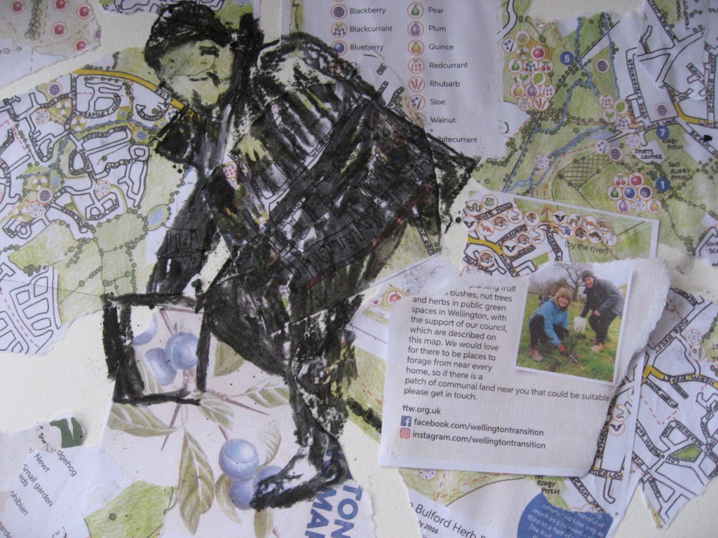
I’m really only interested in the main shapes of the body and heads but I do put in some features that need to be refined. The male figure isn’t too bad but it is hard to get the female right as the photo isn’t really clear to see her back leg. However, I can try to imagine this and use some of the ground. Her hair is okay but in contrast to where the males face is there is more shape of the map showing through. I don’t think this matters too much but I might refine it. I leave it there for today but take a photo of the whole thing.
It is at this juncture that I need to state that my part A and part B of the Assignment task are linked. Before I make my next final piece I do undertake some preliminary drawings. I intend to undertake three main pieces of work that contain the maps. At the Kentridge exhibition which was very inspiring I purchased some red parchment hand made paper and I may use this on my first drawing and my mount will be a black mountboard. A1 size.

I’m really not sure about this and whether it works.
I then decide to undertake other designs. Instead of cutting up the map I would try using the two original linked maps of the area the foraging and the wildlife map together. I would also attempt to adjust the female figure above and come back to this.
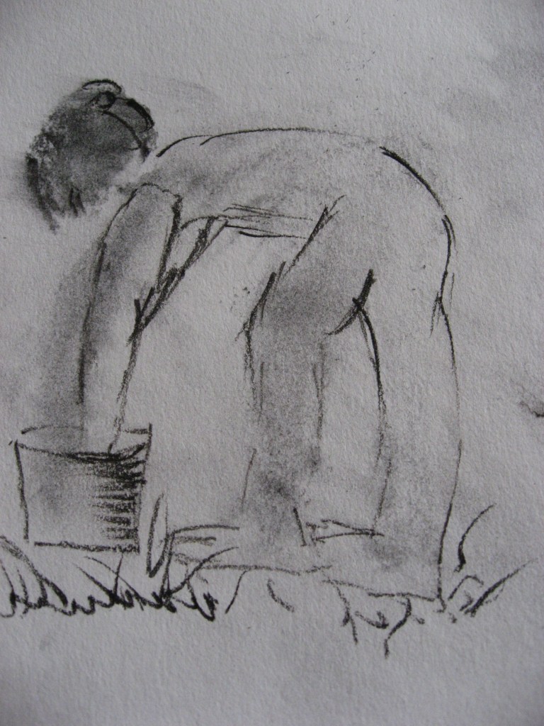
The drawings I’m undertaking are of figures toiling the soil. I will be drawing figures onto the maps similarly to those above in charcoal. My drawings are below.
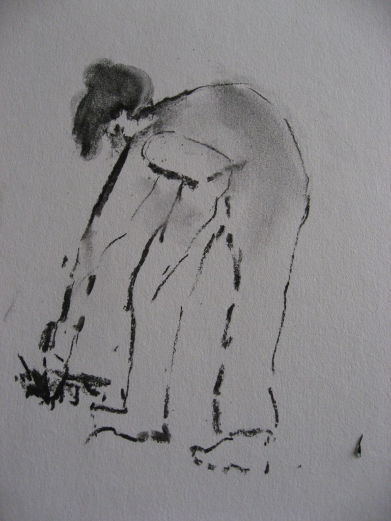
I try to work reasonably quickly initially as this suits me better. I then refine as I go. I allow my tool the pencil or sticks of charcoal to sometimes only skim the paper in a thin and broken line and other lines are more dense. This contrast helps the overall gestural look of the figure.
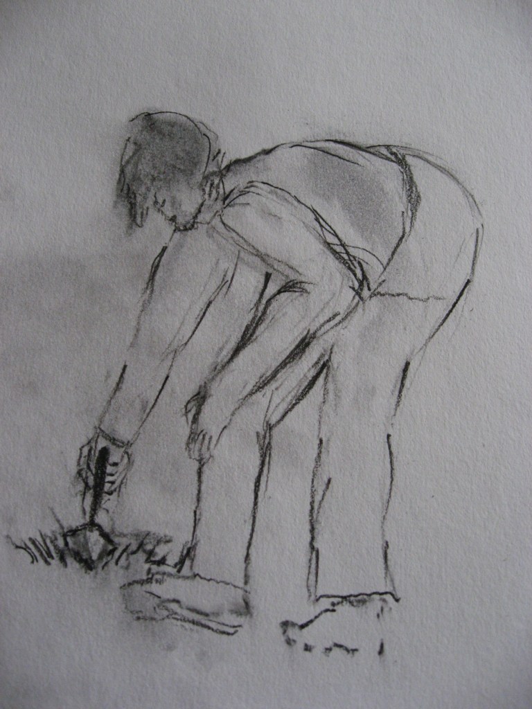
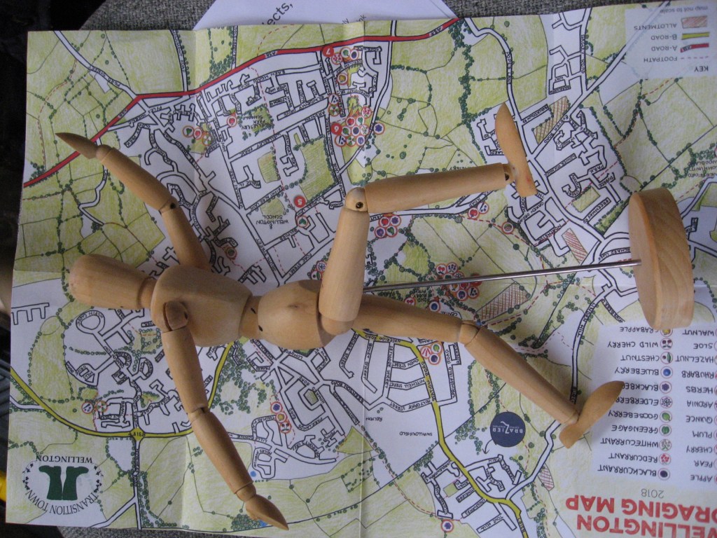
I work and refine this in several places taking note of the shapes of the limbs and muscles and allowing the lines to sometimes overlap. I sometimes use my trusty manikin as below to get the overall body shapes but he doesn’t kneel!
The second figure below is not perfect but some of the strong lines work well in terms of creating shape and form. These drawings help me practice for my final works.
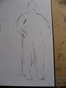
The drawing above is a little clumsy in shape but again I will refine it.
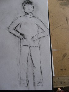
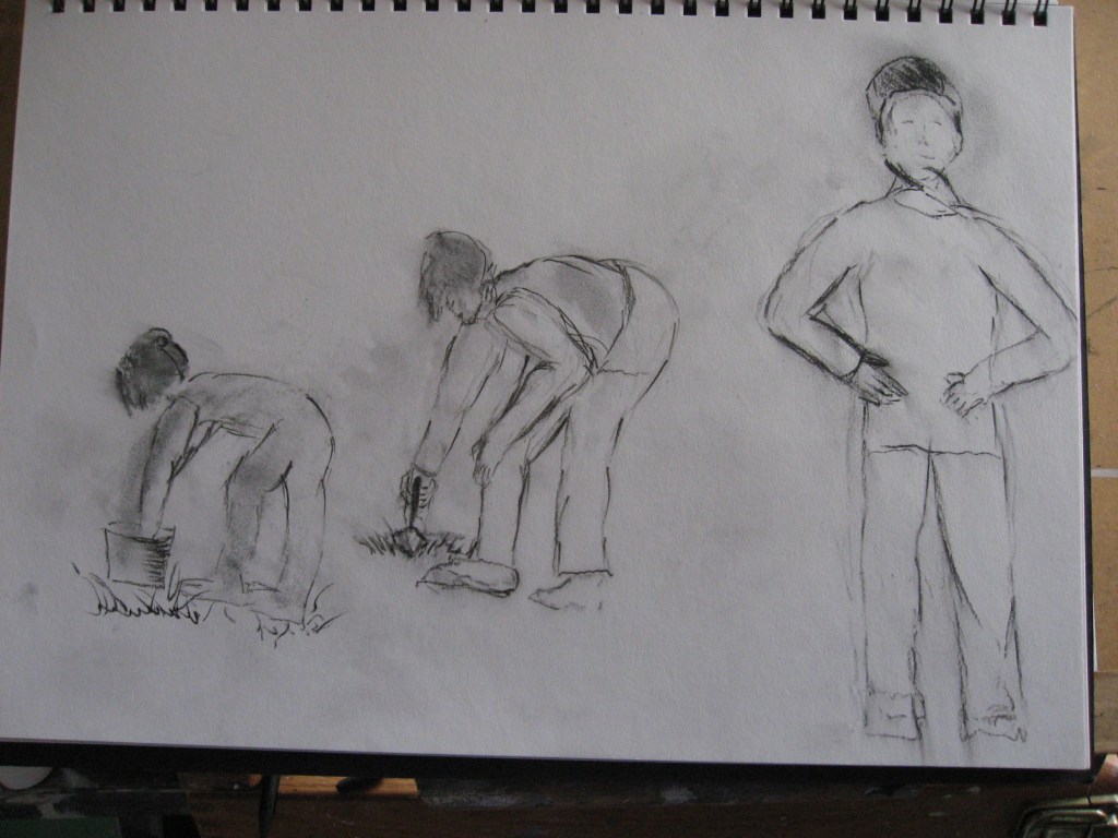
I undertake another drawing below. The leg and the shape of the back are distorted.
Above more refinements. Rubbing in and out and creating better shape and form. I’m really beginning to enjoy drawing and am less fearful of it.
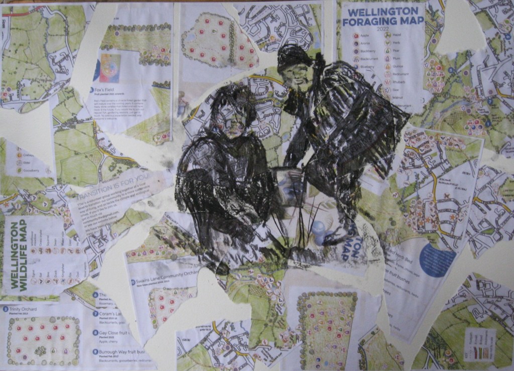
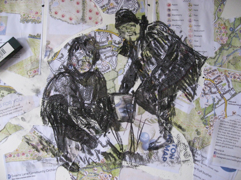
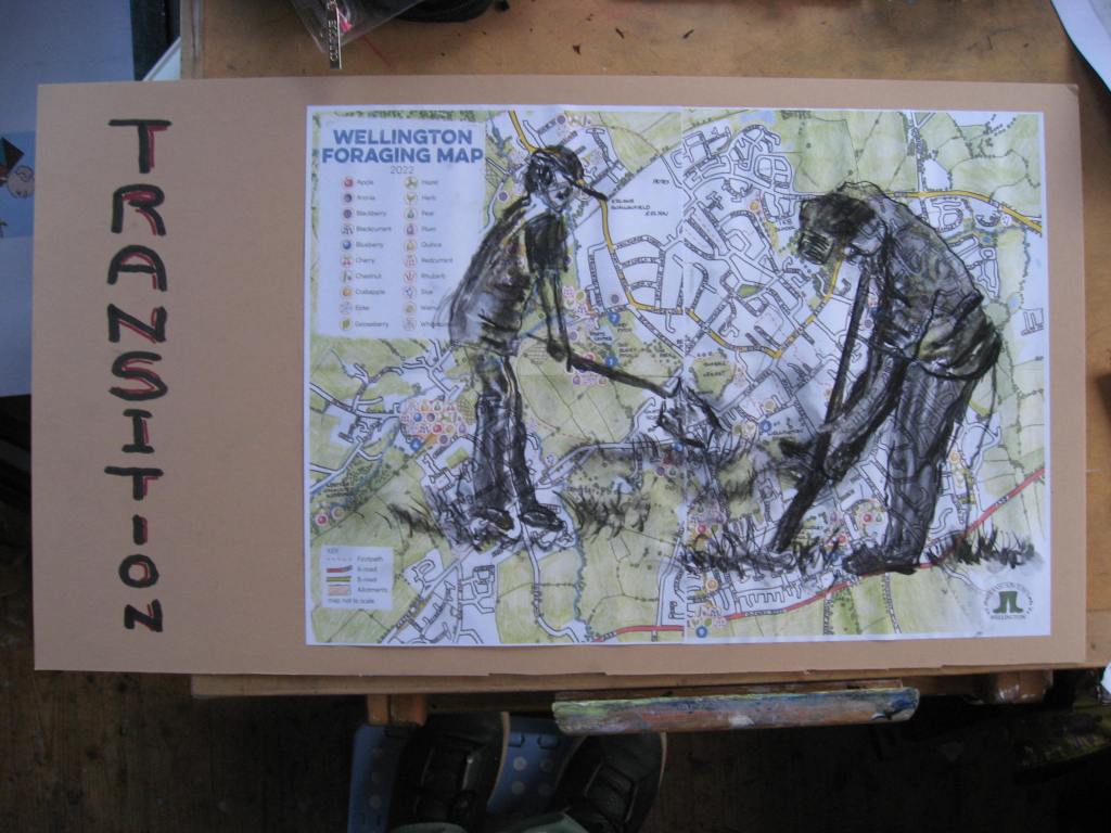
My next piece of work is with the foraging map just pasted without ripping it up. I use a mountboard and this time use pritex to glue it to the surface. I use two A3 maps. I deliberately place the maps so to leave some space for text at the left hand side. A photo is below as I begin to draw my figures onto the maps. The images are of two men with baseball caps and they both have spades.
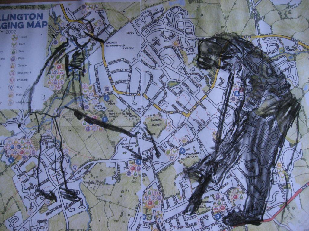
The image below shows the final image on the map. I’m quite happy with the darks and lights to show their shape and form.
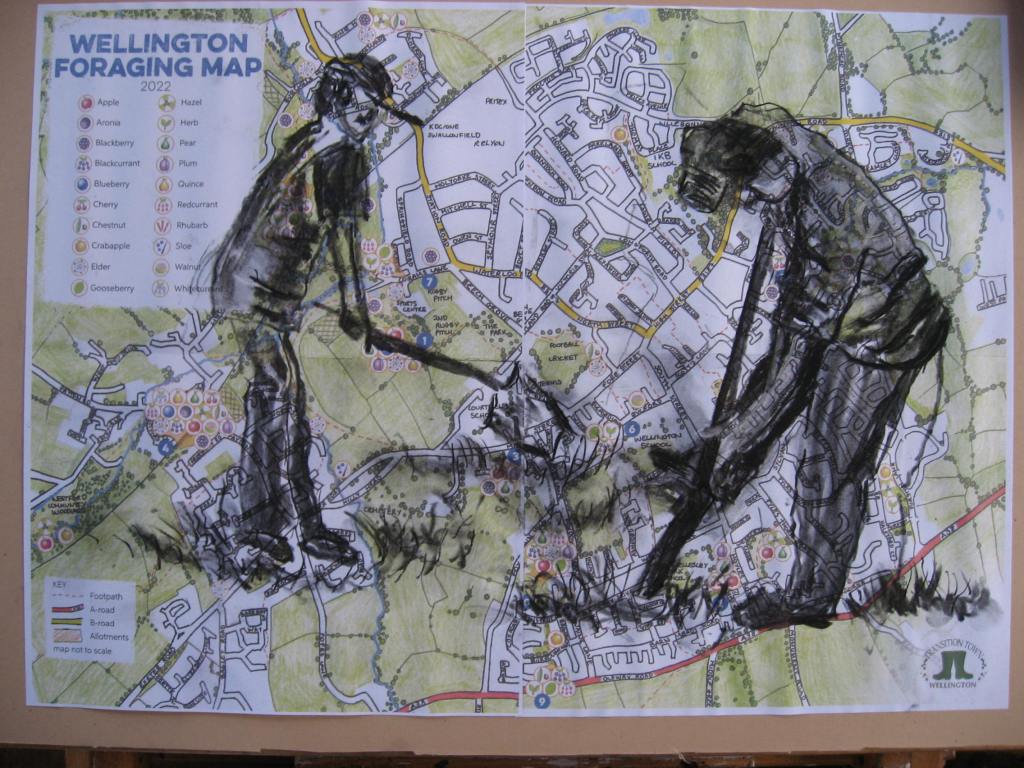
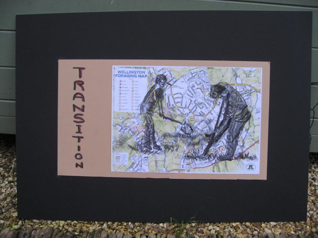
The next stage with this drawing is to write transition on the left hand side of the mountboard. I’m going to make the text smaller as I write it to signify the play on the word transition or change. I also decide to highlight the work in red.
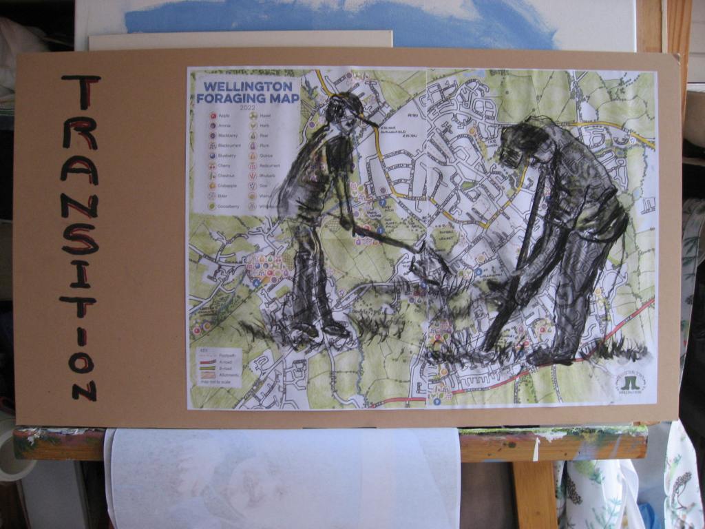
I think this works okay but will mount it on my larger black A1 Mount.
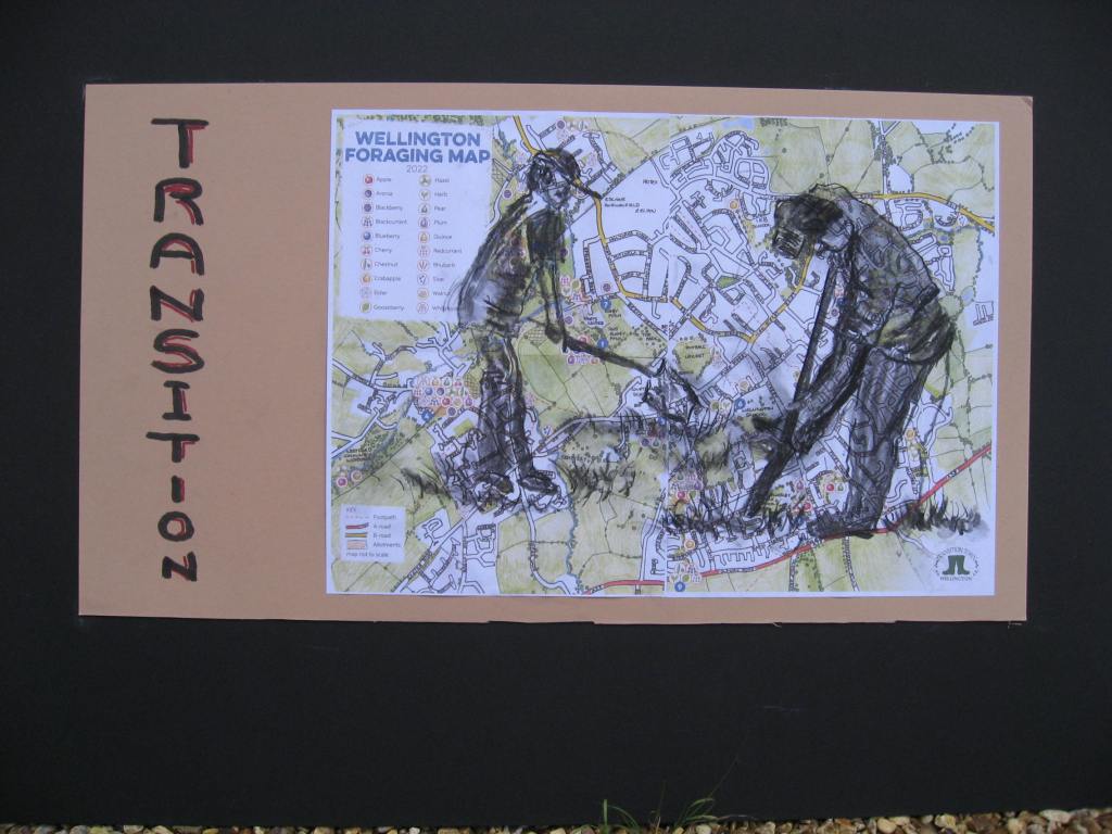
Today I adjust my first image a little and improve on the legs of the woman in the picture. My A1 mountboard has arrived. I use prit stick to just attach the work to the boards. I could have mounted these with cut mounts as I do have the tools but time is against me. If these are reasonable I might use these in the exhibition and get them framed up.
My first one is below with the adjustments. I use hair spray as a fixative as I heard this was good. I take this first photo outdoors as the light is fading and its only 2pm! My studio is dark.
I include another close up of the drawing.
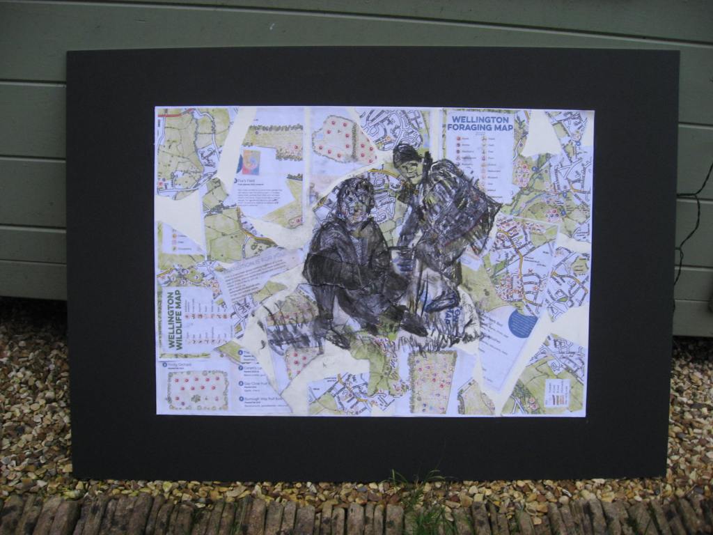
Below is my second image mounted on the black board. I do quite like the drawing on this. The wording might be a bit better but I have deliberately made the lettering smaller as the word unfolds.
The image below is taken in the studio without the mount.
I’m a bit paranoid about whether my photos are good enough so I took this image of both works outside my studio. They look okay together maybe? Although different in style I think they work well together.
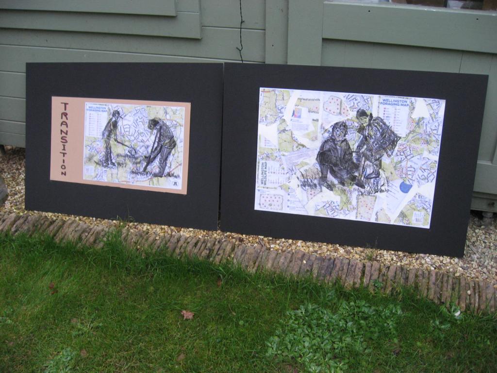
As I reflect on the two works if I do a third I think it would be on the fuller map rather than tearing them up. I like the beige mount as a surface for the figures.
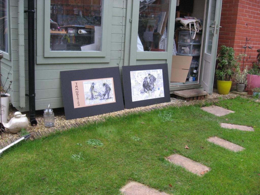
Another image outside the studio. My next job is to tidy up!
I am very conscious I may have worked this assignment slightly differently than the brief but I want to make sure that I am creating work that is relevant to my parallel project and future work. I have learned such a lot about mapping and my drawing is really beginning to take shape. It’s all about the contrasting darks and lights and while this primarily relates to the charcoal it also applies to any colour so I think my overall paintings will improve too. I do feel I’ve worked hard on this part and crammed a lot in with the visit to London. I just hope my work is okay.
While I’ve mentioned the contrasting dark and light through the use of charcoal I must also make reference to a recent book I purchased. It’s a book by the printmaker Angela Harding and it’s called Wild Light A printmakers day to night. She was the illustrator for the book the Salt Path Raynor Winn. The illustrations in her own book are fabulous and I will include some in part 5. In the book she states.
Light to dark, dark to light is the pattern of all our days. Each day the quality of light is something that affects us all profoundly. The low light of an English February morning over undulating hills, or the sharp, bright midday light of a British seaside town in July, can really affect our moods. Light and how it changes transforms the things we see around us.
The book is fabulous and this important statement will hopefully be reflected in my work.
